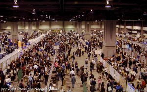
 Here are a few opinions (mine, at least) on how sessions might be improved by the organizers of meetings. If you know the session chair in your society, please forward this post to him/her.
1. Provide guidance on poster aesthetics, audience, word count
Conferences are announced a year or two in advance on web pages, and those pages should give presenters more than just the due date. If you say, “Try to keep your word count under 800, use graphics, and design for people outside your field,” you might find that poster sessions are better attended and enjoyed. And about that word count suggestion — just choose something, since “keep your word count low” means “under 8,000 words” to the average poster designer. If you can provide the above guidance, make sure it is added to a stable page on your society’s main web site, not just on the temporary page associated with the upcoming meeting.
2. Provide links to poster guidelines
If your society can’t be bothered to come up with guidelines, find a web site or online PDF that pitches advice appropriate for the kind of session you are organizing. Again, house this on a permanent page.
3. Don’t provide templates
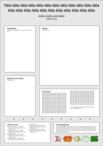
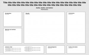 It’s tempting to post a PowerPoint template online, but that encourages attendees to use PowerPoint, which was not designed for posters. Providing a template also encourages all the posters to look the same … and that would make for a mind-numbing session. Also keep in mind that if you post a template with lapses in aesthetics, color choice, font size … everyone at the meeting will adhere to those lapses. I find glaring mistakes in almost all conference templates I have looked at, and I’ve looked at a lot. If you must post a template, hire a graphic designer to make one for you.
4. Don’t require logos or banners
Branding attendees’ posters doesn’t really add to the quality of the poster session. All it does is remind people that they are attending the meeting, which is silly unless people drink heavily and black out. Mandating a logo at the top of posters also squishes the title to be smaller, and adds a visual distraction that competes with graphic elements on the rest of the poster. If you really want to brand things, give attendees t-shirts and handbags.
5. Don’t require abstract on posters
A poster is an abstract. But it’s totally great to include a poster abstract in the conference booklet to help people figure out which posters they’d like to visit.
6. Show examples of good posters
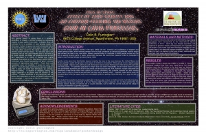
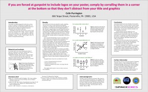 Scientists learn how to design posters from their mentors and colleagues. Yes, that’s really alarming. So find a few good posters on the internet and link to them as examples. Ideally, get permission from the poster owners to display large versions of the poster directly on your conference page (links are fine, but most people won’t click on them). Give some commentary about each poster so that attendees know what is good about it.
 7. Show examples of bad posters
Placing awful posters on your society’s web page can be a great way to communicate what not to do. You could also hang an awful poster at the poster session to generate conversation on design issues (“OMG that’s hideous!”). It could be fun, and might help improve the quality of posters at future meetings.
8. Post judging criteria, evaluation form online prior to meeting
If posters will be judged for prizes, tell attendees what criteria will be used. Ideally, post the forms that the judges will be using (shouldn’t be a secret!). And, please, don’t give top award to the poster with smallest font: that just encourages people at future conferences to use even smaller fonts.
9. Sponsor a fun “people’s choice” award
Even if you have official judging, set up a voting box in the poster session room for attendees to nominate posters for a “most enjoyable/creative/novel” (or whatever) award. There’s always one at a conference, and it would be nice to give them credit somehow, even if the judges didn’t give them any love.
10. Provide 4×6” poster stickers to presenters
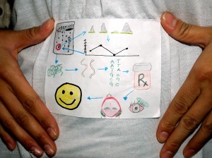
 When people arrive at the meeting, have colored pens and pencils on a table and ask them to sketch their research. Making these sketches can energize the entire meeting, not just the poster session. E.g., people will proudly point to their mini-posters and explain their research. If you can list the time and place of your talk/poster, that will increase chance people will come. I’ve done poster design workshops involving these sketches for over a decade (at Swarthmore College, Sigma Xi meetings, NYAS, EPA, DOE, etc.) … and would love see to it catch on at meetings. It’s fun! If you’re curious, it’s mentioned in this article.
11. Specify horizontal posters, not vertical posters
 I get it: it’s much cheaper to pack portrait-style posters into a meeting room. But here’s the issue: portrait-style posters can be really hard to read if they are large and conference attendees have different heights. Either the top of the poster is too high for short people, or the bottom is too low for tall people (see example). For example, males and females have different average heights … that alone might make the poster-viewing experience very, very different. Horizontal posters are much less of a problem for people of different stature. Plus, a horizontal poster allows the presenter to situate herself/himself in front of the poster without occluding the whole poster. In contrast, standing to the side of a portrait poster means standing in front of neighbor’s poster.
But if you can’t resist specifying everyone make vertical posters, at least suggest that attendees situate the boring sections at the bottom, as shown by this example. (See Templates for portrait-style science posters for more information.)
12. Prohibit photography of posters
Sometimes posters have research in progress, and many people would prefer that the tentative results aren’t broadcast to the world in tweets with the hashtag, #candothisbetter? (or whatever). Certainly, if the presenter is present and grants permission for a photograph to be taken, that’s all great. But the default — no pics with camera or smartphones — should put presenters at ease when they are not present.
If you want even more tips, please see my “Designing conference posters” page. I’ve been updating it since 1997 so it’s a tad long, with apologies. Feel free to send the link to your attendees if you’d like.



 Scientists learn how to design posters from their mentors and colleagues. Yes, that’s really alarming. So find a few good posters on the internet and link to them as examples. Ideally, get permission from the poster owners to display large versions of the poster directly on your conference page (links are fine, but most people won’t click on them). Give some commentary about each poster so that attendees know what is good about it.