
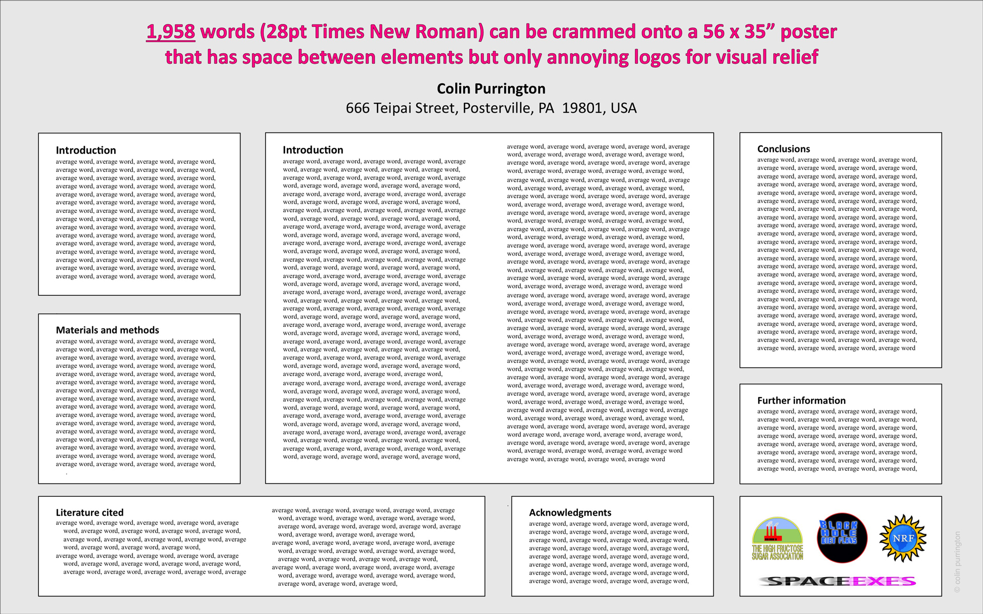
For giggles, I contacted approximately 100 societies with annual meetings coming up, and asked them whether they offered word count suggestions for attendees presenting posters. The majority didn’t write back (no real surprise), but of those that did the most common response was, “I have no idea what you’re talking about.” Some went on to provide me with the word count limit for the abstracts submitted (to get your poster accepted). Only one response had the information I was looking for: “5 pages of 16pt text” as maximum. If you fill up 5 pages with the phrase “average word”, that gives you 1750 words. Personally, I think 500 – 1000 is a good range. If you’re curious what a wordy poster looks like, I’ve attached to this post an image of text-only version of one of my templates.
In hindsight, though, it was probably a silly question. What is more important and understandable to attendees preparing their posters is the minimum acceptable font size, because even in posters with low word count, readability can be awful if all the figure text (for example) is set in 12pt instead of the size of the rest of the body text. If only the poster prize committee would police these limits, though. Whenever I stumble onto a site showing prize-winning posters, committees often seem to be awarding people who have made their font smaller than everyone else, invariably the size is smaller than meeting guidelines. It’s really puzzling. It could be that people with high-quality content have a lot to say, and so they have to shrink font size to get it all in. However, I just think people are somehow wired or trained to attribute small print to “authoritative, creative” and large print to “amateurish, insecure.” Or do judges take longer to read the small text, and thus demonstrate the “disfluency” advantage that gives strange fonts an advantage in memory retention? If there is a typographer/psychologist out there with insight into this phenomenon, please fill me in.
I know it’s never going to happen, but in an ideal world judges would carry one of those fun little plastic shape templates while they review posters. Then they could position the 3/8″ circle (or whatever) over a standard letter (“s” perhaps) to evaluate the size. If the “s” fits without touching the edges, it’s too small and the poster cannot be entered into the prize pool. Something like this would be really useful, because kids these days have no idea what font size means, especially when the final output is large.