Tag Archives: meeting

Templates for better posters

There’s been a frenzy of discussion on Twitter this summer about conference poster design (see #betterposter, #betterposters, #butterposter) so perhaps it’s a good time to re-share my Powerpoint templates. If you’re new to posters please see my page, “Designing conference posters” for details.

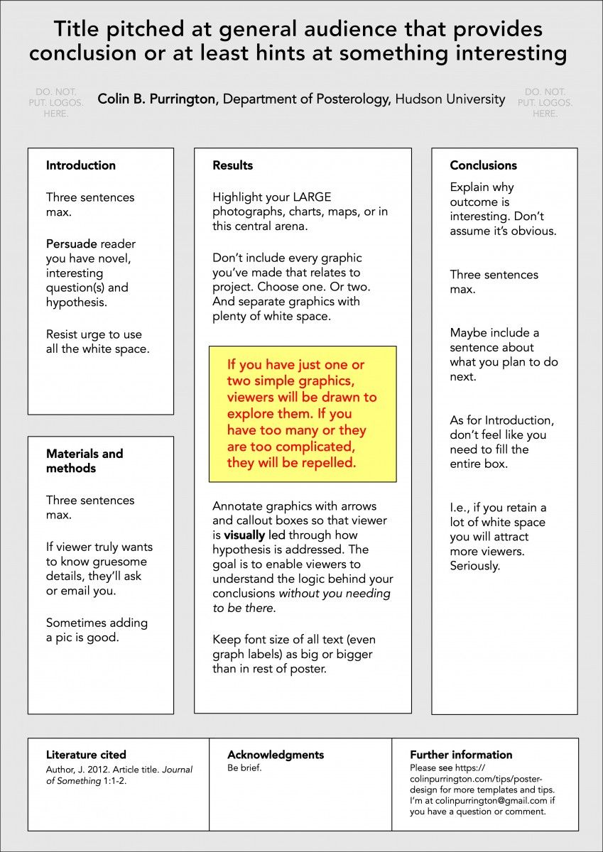
Below is a standard horizontal template. I recommend 500-800 words and 1 or 2 graphics that are understandable without you needing to explain them.

poster-template-horizontal-1-purrington

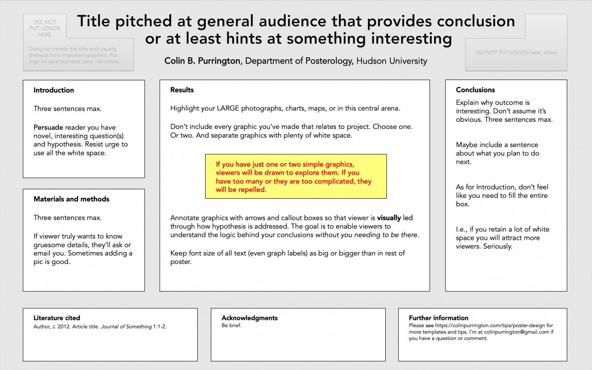
Note that there is no requirement for the text boxes to have a line around them — it’s easy to set line width to zero. And if you want to delete the background color (gray, here), you can eliminate the “rectangles within rectangles” look. Totally up to you.

If you want to include a QR code, put it at the bottom so that it doesn’t distract from your interesting graphs and illustrations. Like this:

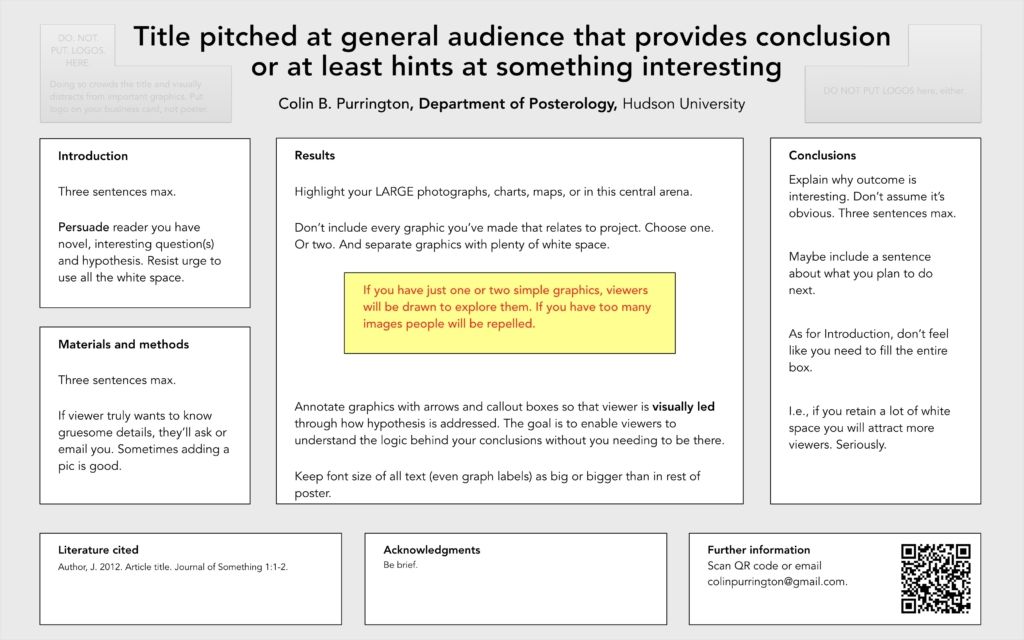
But be cautious about including a QR code. By design it invites a viewer to fire up their camera phone, and I’d wager that most will also take a pic of your entire poster. So skip the QR code if you don’t want people to take pics of your poster. A compromise is to print business cards that have the QR code (as well as poster title, your name, your email address) and then leave them in an envelope pinned next to your poster (“please take one!”).

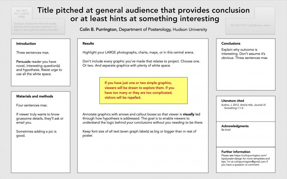
Here’s a template that moves the Literature cited, Acknowledgements, and Further information to the far right column … which causes the Materials & methods and Results areas to have more room. But the Conclusions box gets squished (such is geometry).

poster-template-horizontal-2-purrington

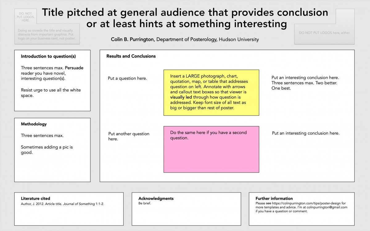
Here’s a template that might work for a humanities topic. I’ve chosen to have a question/result/conclusion flow (from left to right) inside the main arena, but you can always rearrange. There are also no rules about section names — just redo those, too.

poster-template-horizontal-3-purrington

The final template is a portrait-style one. For this orientation I think it’s critical to put the least important sections on the very bottom (that position is really hard to read without stooping).

poster-template-vertical-purrington

If you’d like to read an article about the better posters frenzy, here’s one from Inside Higher Education in which I’m quoted a few times.

Fabric conference posters

I was invited to talk about poster design in Berkeley (DOE NNSA SSGF) and DC (DOE CSGF) this past summer, and used the opportunity to test out fabric as a medium for large-format conference posters. Below are some photographs if you’re curious how logos, illustrations, and photographs look when viewed close up on fabric. By the way, I ordered the posters from PhD Posters (they mailed to my house in a tube, inside a box). And if you’re interested, my poster design tips are here (rather long-winded because I’ve maintained page since 1997).

fabric-posters

The rolled up poster above is also fabric. I didn’t have the nerve to fold it into luggage-sized square, but I’ve heard that it can be done … though crease lines an issue. Might be able to iron them out, I’ve also read.

photograph-on-fabric-poster-I

The photograph above isn’t as crisp as a glossy poster, but was totally fine for my purposes. If it really mattered, I’d just print a copy on my photo printer at 1200 dpi (or whatever) and then use double sided tape to attach. Even paper posters have fairly low photo quality, so attaching a high-resolution version is always an option when you need it.

photograph-on-fabric-poster-III

Yes, you can see the fabric if you get close enough. People standing 6 feet away wouldn’t notice and probably wouldn’t care if you told them.

illustration-on-fabric-poster-I

illustration-on-fabric-poster-II

graph-on-fabric-poster

logo-on-fabric-poster

This logo is actually from the poster that is rolled up. It’s at https://colinpurrington.com/2012/example-of-bad-scientific-poster/ if you want to see the whole poster (you can download and print for your class, if you’d like; yeah, students would just love that).

fabric-poster-edge-detailThis photograph shows how the edges can get a little frayed. Holes from pushpins are also visible. Much less annoying than the rips and gaping holes that paper gets.