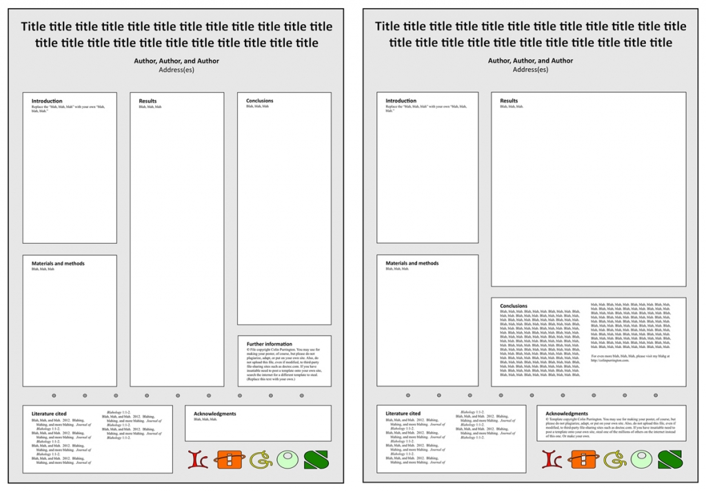
Just a website update for those who care about scientific posters: added two Powerpoint templates with portrait-style orientation. The one on the left is for people who love columns. But I like a big space for results so that you can show off the big finding, so I prefer the one on the right. I call that big space the “Results arena.” But the disadvantage of the one on the right is that your conclusions are moved down low, and taller viewers have to bend their necks a tad to read it. But if your results stand nicely on their own, it can work well. Both versions, like all my templates, nudge you to put logos at the bottom (ideally, delete them altogether … you don’t need logos). Find the downloadable PPT files in my Designing conference posters page.
Colin Purrington's blog
nature photography / natural history / misc


I like the poster on the right, but would like to present my results somewhere at the top (or maybe even center). Is that also possible?
Currently the Results section is at the top, so I’m a little confused. Do you mean above the title? I wouldn’t recommend that, if that’s your desire.