
The most effective, cheapest way to control mosquitoes is to eliminate the standing water that larvae need to develop. A dry yard doesn’t have mosquitoes. It’s really that simple. Below is a list of objects to get rid of or dump regularly. Please share with your neighbors.
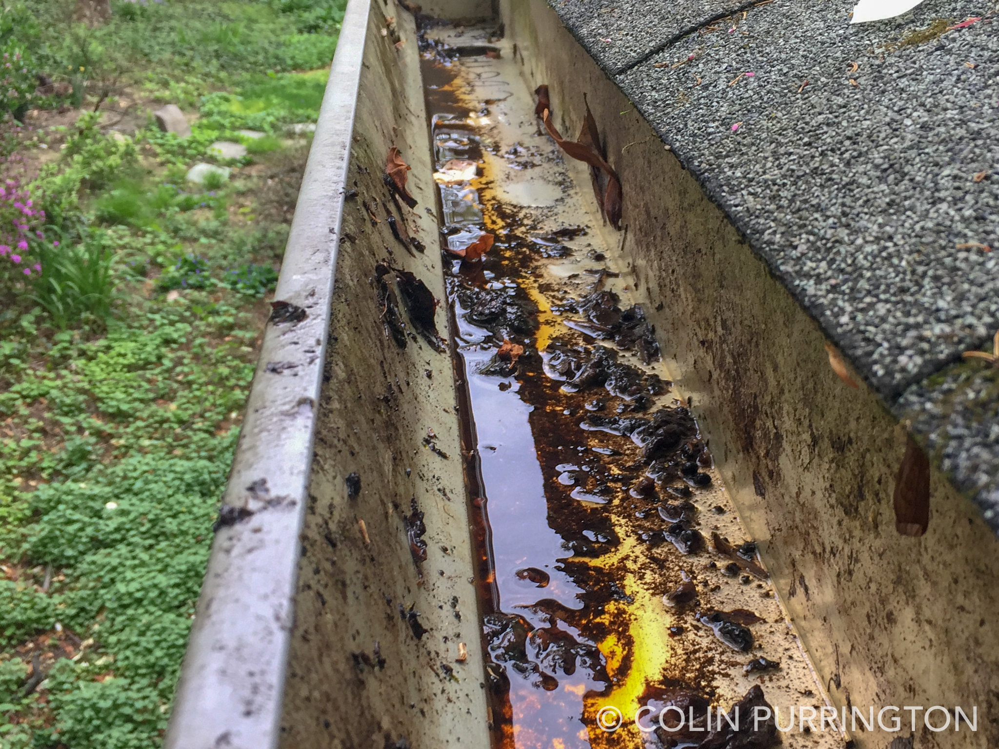
1. Gutters
This is at the top of the list because almost all houses have gutters and almost all homeowners hate to clean them out. Check for blocked gutters weekly if you have a lot of trees nearby. If gutter status is hard to see, buy a drone to facilitate inspections. If you can’t afford a drone just get an extra-long, telescoping selfie stick for your smartphone.
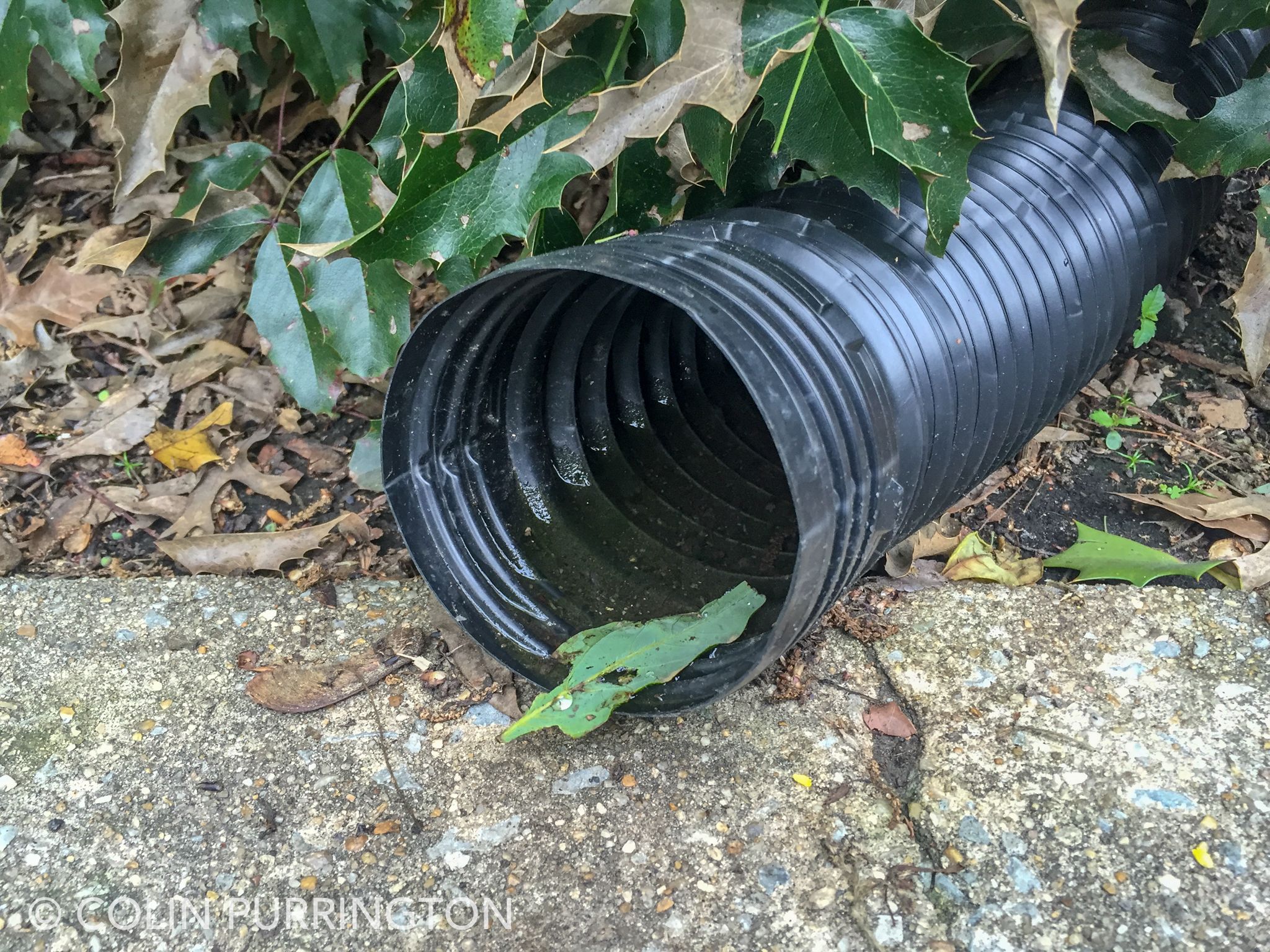
2. Flexible downspout extenders
Flexible downspout extenders are perfect for mosquito larvae — the ridges hold water and the black absorbs heat from sunlight (thus speeding development). They are especially bad if nestled in shrubs and ground cover. Note that they hold water even if they are sloped downward. Get rid of them. All of them.
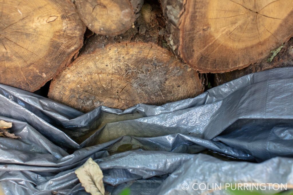
3. Tarps
If you leave a tarp in your yard, you’ve created lots of nooks in which water and debris will accumulate. I frequently see tarps covering soggy logs that owners seem to have no real intention of ever splitting into firewood. I think people view tarps as cloaks of invisibility, magically hiding loathsome to-do items from spouse.
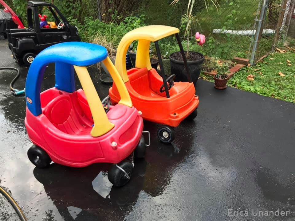
4. Toys
Sandbox toys, sleds, wagons, and kiddie pools seem as if they were specifically designed to encourage mosquitoes. I.e., even when stored upside down they have nooks that collect enough rainwater to allow mosquito larvae to mature. Store them in the garage. If you think covering them with a tarp will work, please see #3.
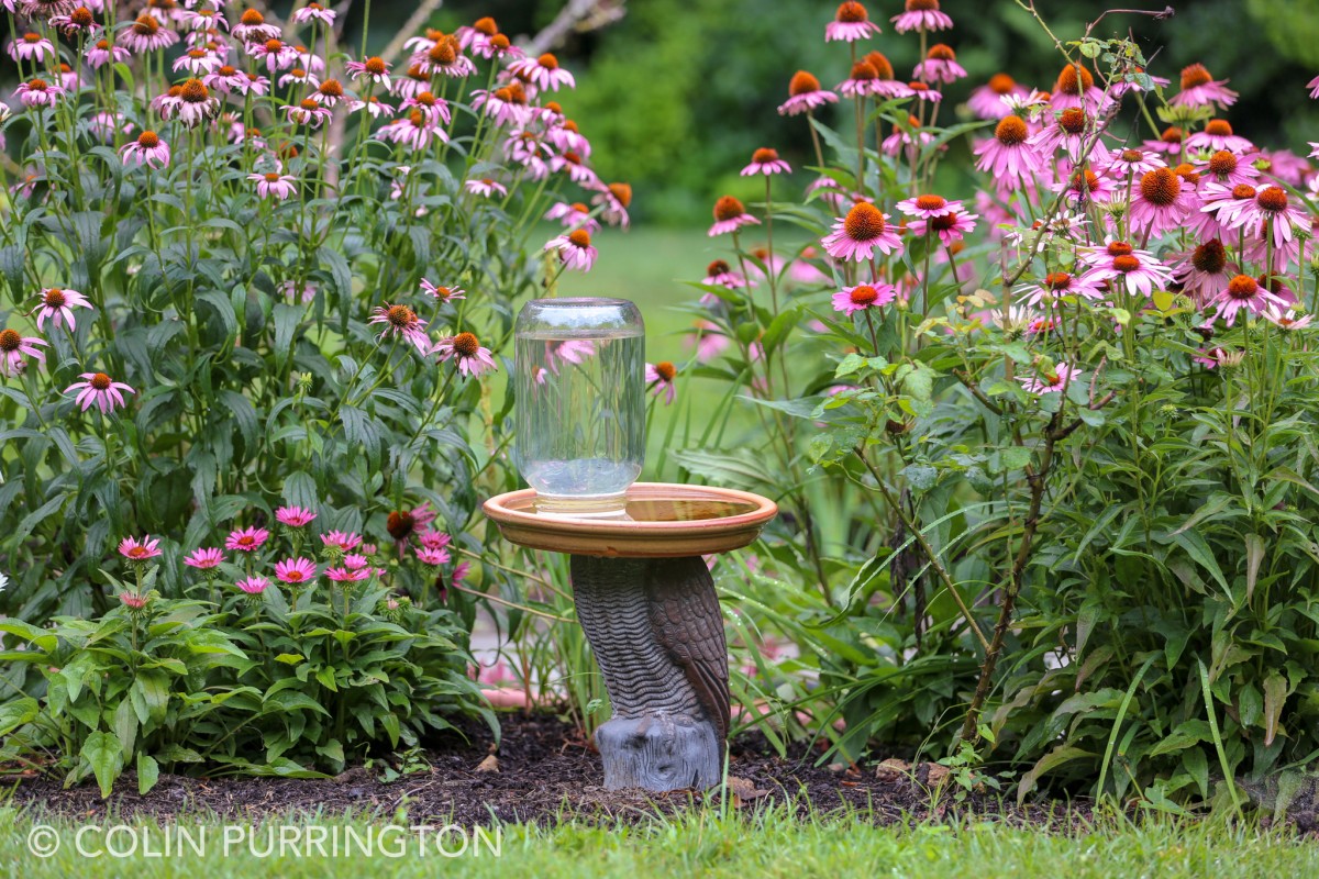
5. Bird baths
Everyone should have a bird bath. But if you do, you need to either have a water bubbler/agitator (mosquitoes hate that) or you need to kill the larvae by adding granules of Bacillus thuringiensis var israelensis (abbreviated, Bti). Bti is extremely effective: you can add it a container that has thousands wriggling of larvae (see movie) and they will all be dead within hours. Just add it every two weeks and your bath will always be mosquito free. But don’t forget — make yourself a smartphone reminder or write on paper calendar.
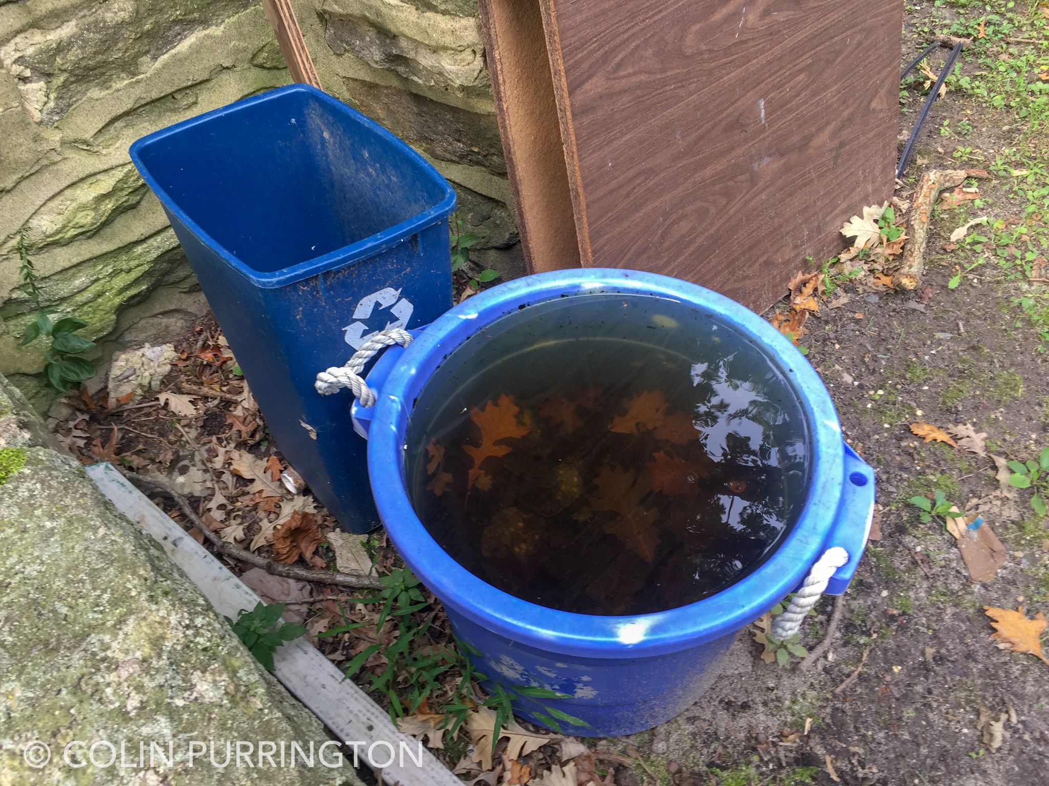
6. Trash and recycling bins
If you can’t store your trash and recycling containers under a roofed area, keep a lid on them. I found the ones below behind a local church. Tens of thousands of larvae within.
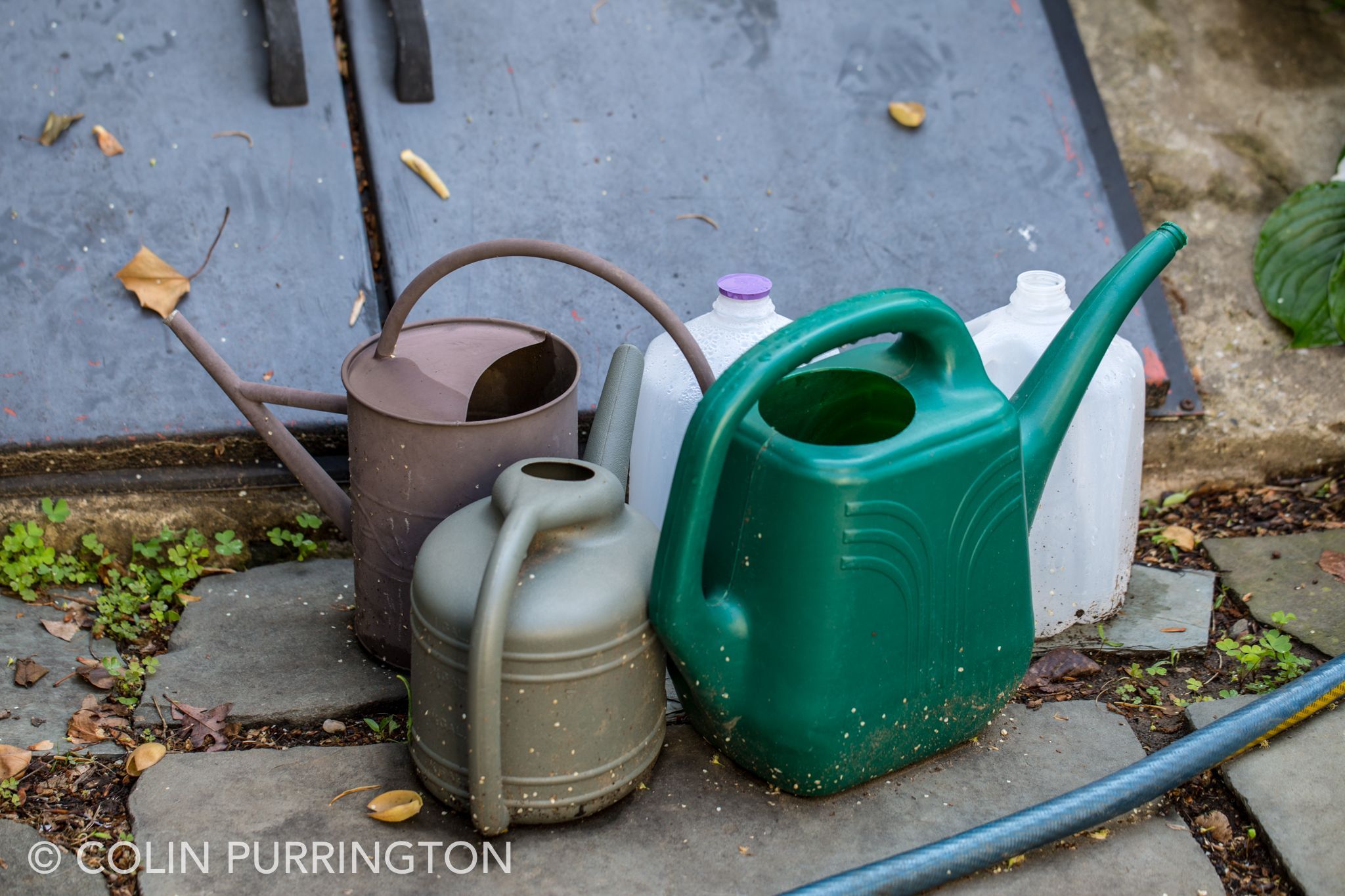
7. Watering cans
Watering cans are rarely transparent so you can’t see the mosquito larvae inside, but they are present if you leave them around the yard when it’s been raining a lot. Store them empty, in garage.
8. Wheelbarrows
Just keep them propped up vertically so they don’t accumulate rain water. Or drill holes.

9. Rain barrels
Just put screening over the top. Or add Bti every other week. I don’t recommend adding mosquito-eating fish because they die when water level gets low (plus the fish suffer before dying).
10. Pot saucers
Pot saucers are unneeded outside so it’s easy to eliminate them. If you like them for decorative reasons you’ll need to add Bti regularly. It’s better to just get rid of them because you’ll eventually forget. You know you will.
Other places where mosquitoes larvae thrive
Other objects of concern are: pool covers, pot saucers, grill covers, plastic kid toys, tires, unattached hoses, empty glazed pots, shovels, construction materials, garbage cans, garbage can lids, containers in recycling bins, bottle caps, cemetery vases, decorative shells, empty coconuts, papaya tree stumps, downspout troughs, spigot drips, ollas, pickup truck beds, window wells, septic tanks, uncapped metal fence posts, animal tracks. Mosquitoes will also lay eggs inside in toilet bowls, animal water dishes, and French drains.
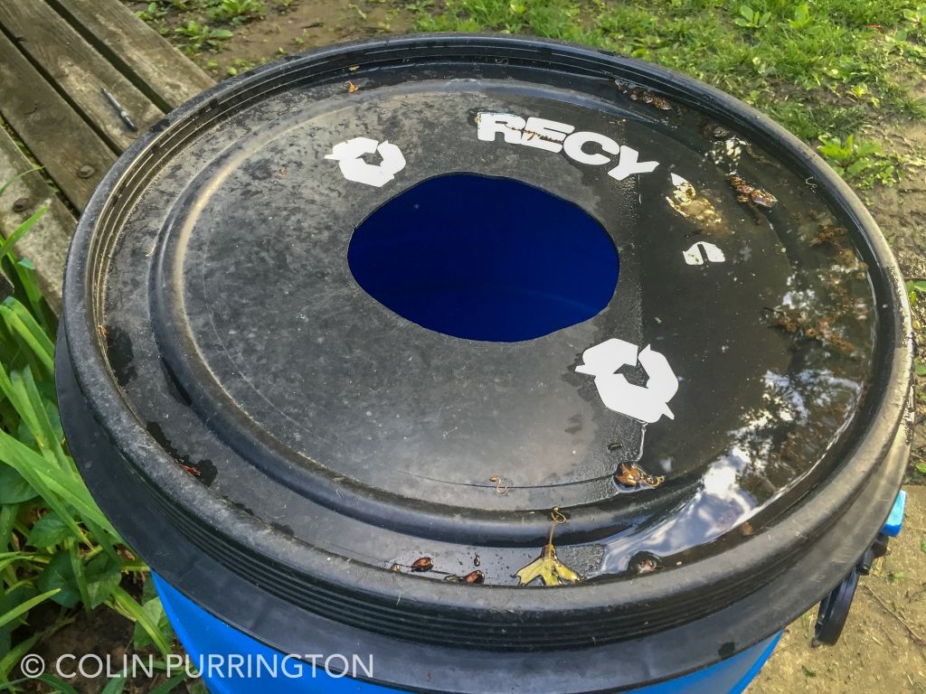
Recycling bin lid 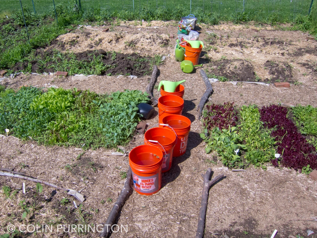
Buckets at community garden 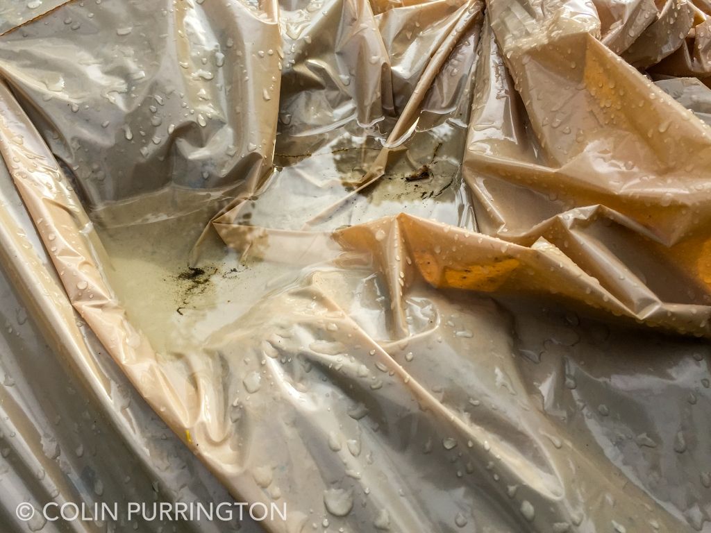
Garbage bags 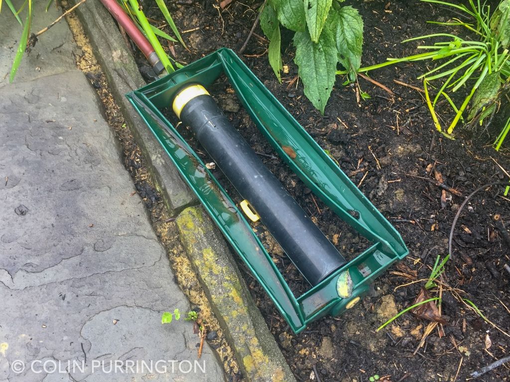
Upside-down sprinklers 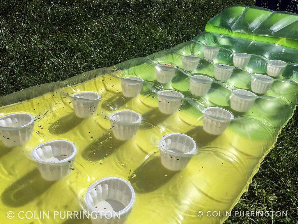
Pool floats 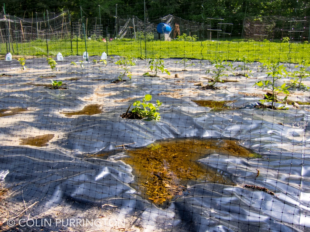
Plastic mulch sheets 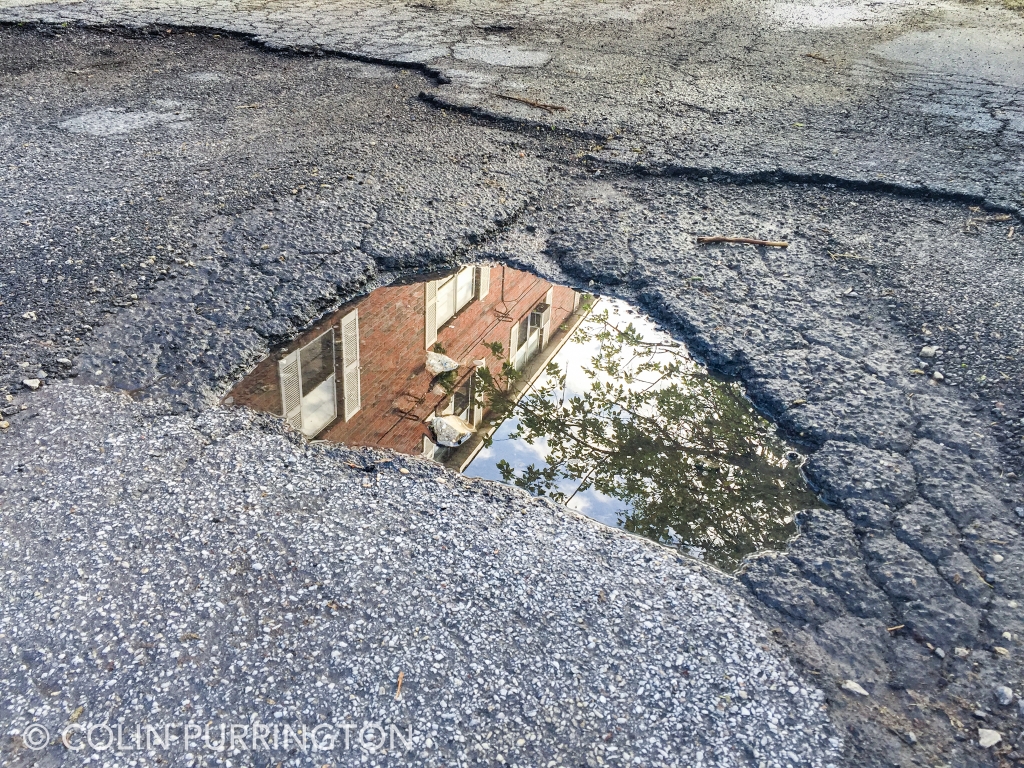
Driveway potholes 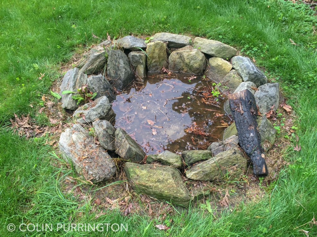
Fire pits 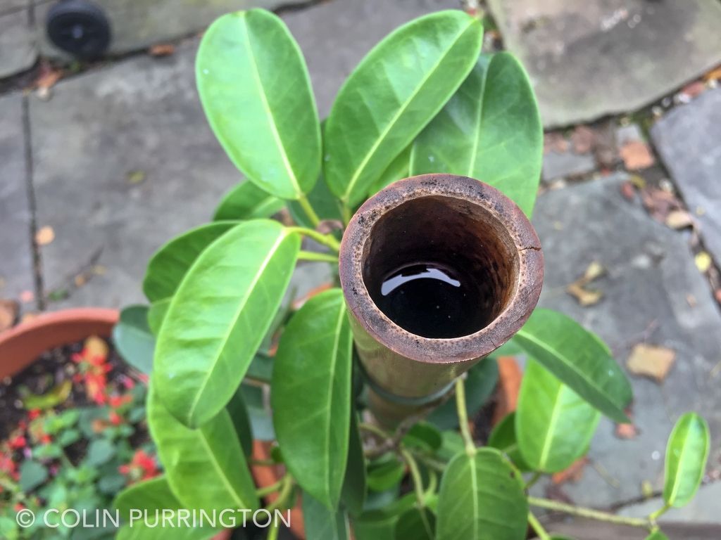
Bamboo garden stakes 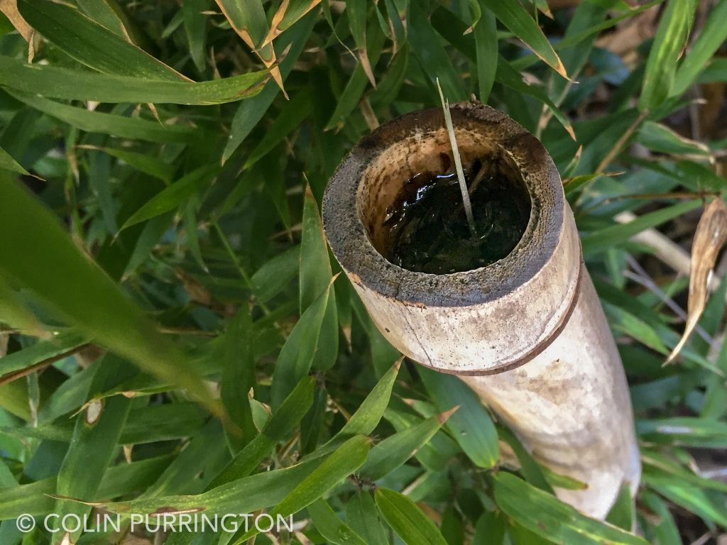
Bamboo culm stumps 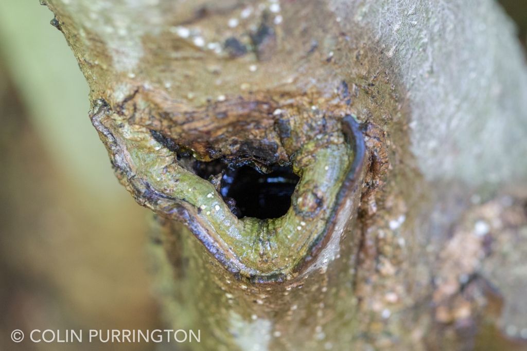
Tree holes 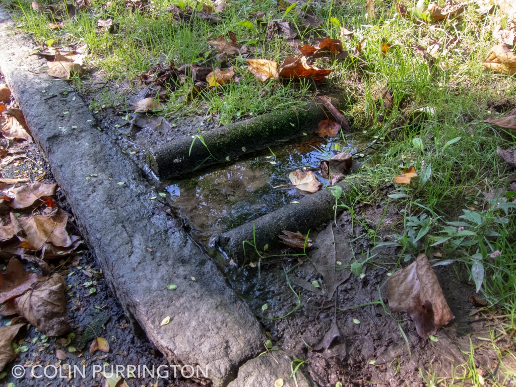
Sump pump outflows 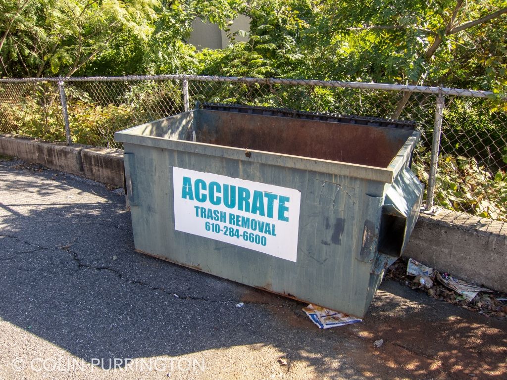
Uncovered dumpsters 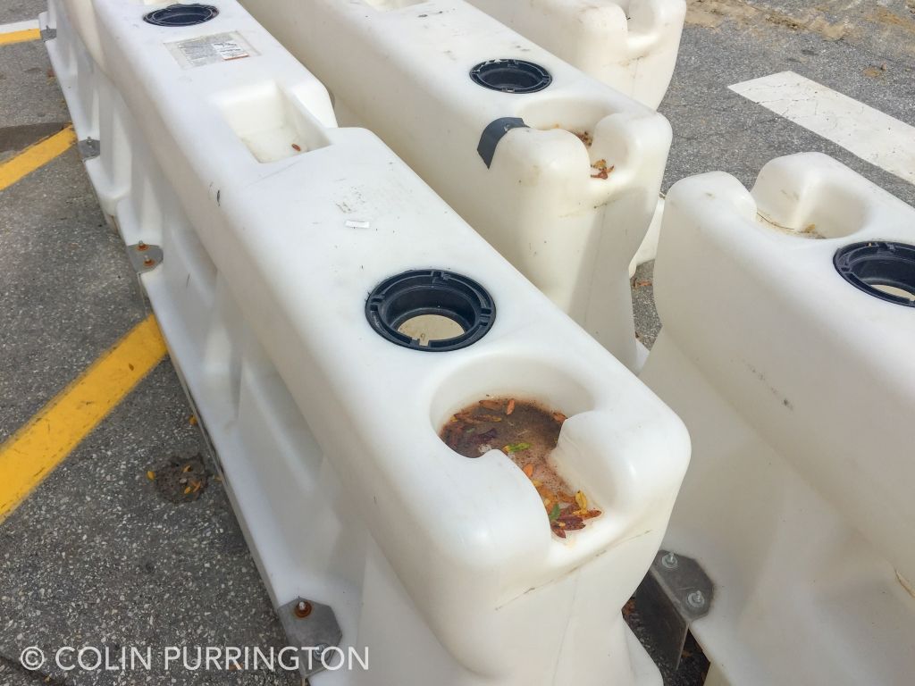
Uncapped traffic barriers 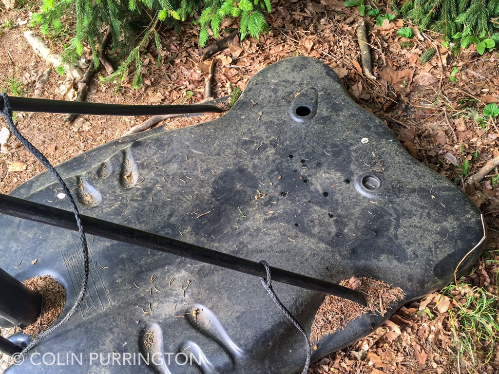
Basketball hoop ballasts