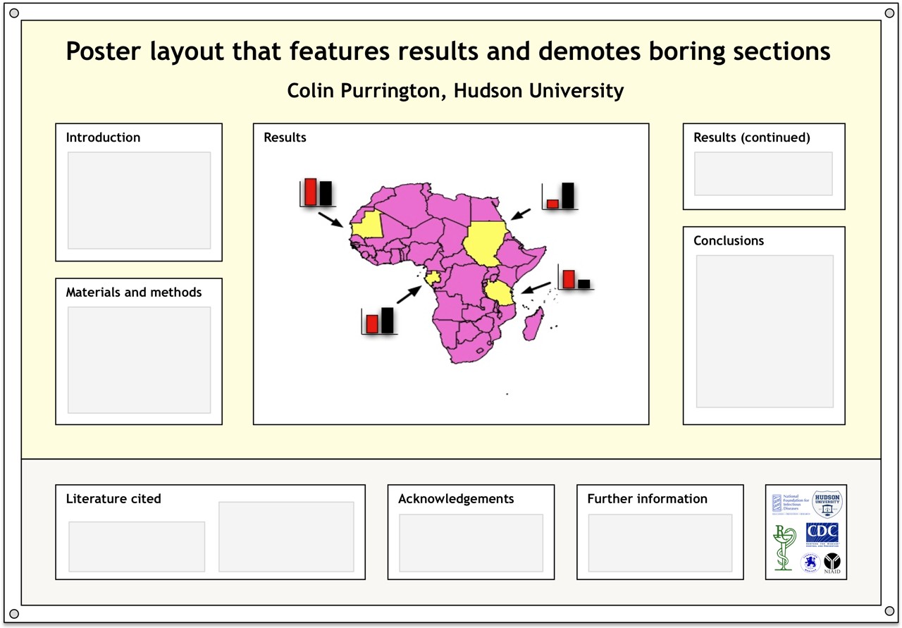
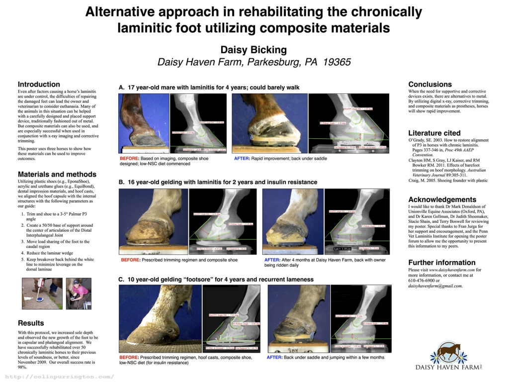
One of my pet peeves about posters at conferences is that they often devote a lot of important real estate to text that nobody really wants to read. So if you’re shopping around the internet for a layout, give the layout below a try. I’ve situated the Literature cited, Acknowledgements, Further information (a section I’m trying to push), and annoying logos in a single strip at the bottom. Doing this pushes the interesting sections up, closer to eye level. I’ll eventually put a template for this up at https://colinpurrington.com/tips/academic/posterdesign.
For those who are interested, the logos in the sample layout are largely related to diseases: I’m presenting at the 2012 Annual Conference on Vaccine Research sponsored by the National Foundation for Infectious Diseases. I don’t know anything about vaccines, for the record. I’m just there to present at a workshop on science communication. I’m bringing hand sanitizer, of course.


