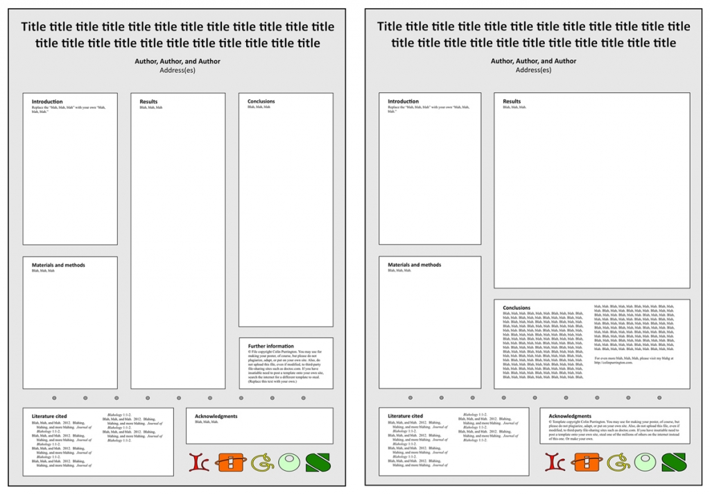
Just a website update for those who care about scientific posters: added two Powerpoint templates with portrait-style orientation. The one on the left is for people who love columns. But I like a big space for results so that you can show off the big finding, so I prefer the one on the right. I call that big space the “Results arena.” But the disadvantage of the one on the right is that your conclusions are moved down low, and taller viewers have to bend their necks a tad to read it. But if your results stand nicely on their own, it can work well. Both versions, like all my templates, nudge you to put logos at the bottom (ideally, delete them altogether … you don’t need logos). Find the downloadable PPT files in my Designing conference posters page.
Tag Archives: powerpoint
Poster page revisions
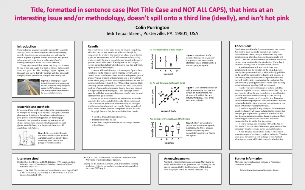
I finally got around to making some long-needed changes to my page on designing conference posters: https://colinpurrington.com/tips/academic/posterdesign. For those who care, the poster-like file with poster tips is now just a PDF, not a Powerpoint template. This PDF will hopefully be useful to those who want to both an example layout and tips on how to craft a poster. Teachers can print this PDF out on a large-format printer and pin it to classroom wall a month before student posters are due. The second big change is that the Powerpoint templates are now text-light, which will make them easier to use as templates (i.e., no need to delete all the annoying “tips” text that was there previously). Templates now come in a few different flavors, too (and more coming). Finally, lots of minor changes to the page itself, though just as long-winded, with apologies. If you know of somebody who needs poster help, please feel free to send them the link.


