Like most monarch fans, I dutifully pack my yard with milkweed and hope the offering will somehow offset the effects of habitat loss and pesticide applications on population levels. But I’m not a complete idiot so I know that my contribution is probably rather inconsequential. Planting milkweeds for a few dozen monarchs is not really going to help population declines.
So this year I finally got around to something I’ve been meaning to do for years: give away lots of milkweed plants. My goal was to distribute free seedlings to several hundred people in my town (Swarthmore, Pennsylvania), ideally creating a concentration of milkweed that might make a difference. And because milkweeds are perennials and produce seeds that disperse with the wind, all of those initial milkweeds would do their reproductive duties for years, seeding vacant lots and such. Perhaps after a few years we will start seeing flocks of monarchs again (I’m an optimist).
This post summarizes how I grew the plants and gave them away, just in case anyone else might be nudged to do something similar. If one person in every town did this we might reverse the yearly declines in monarch populations.
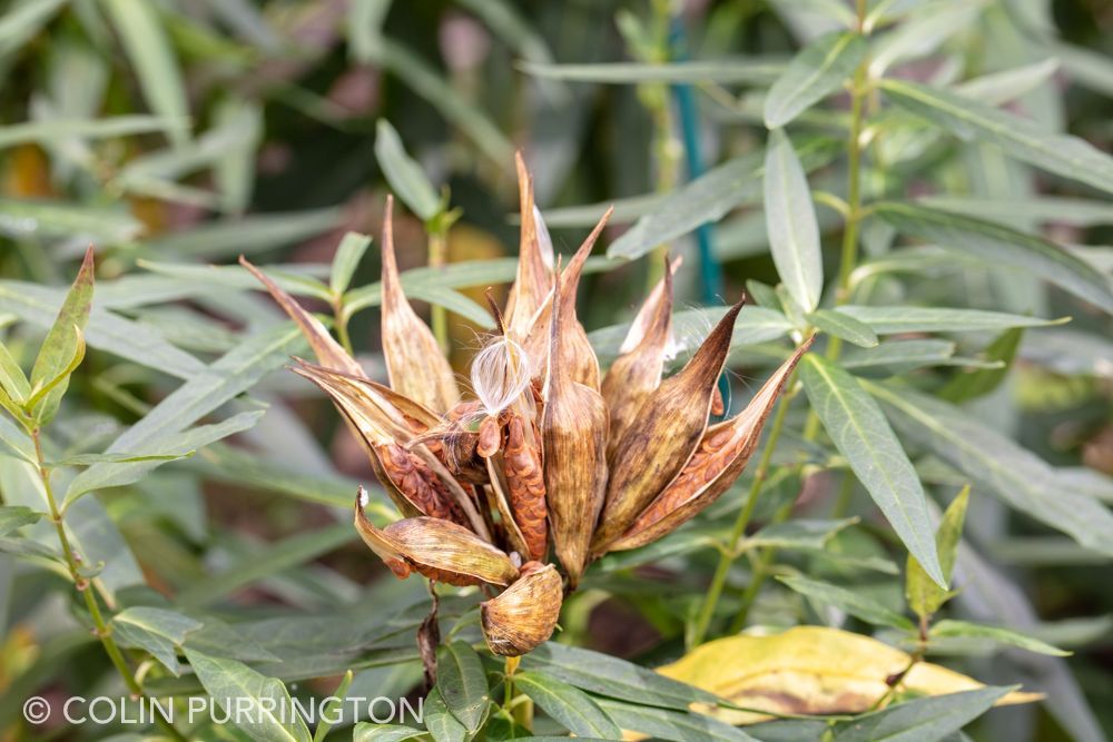
Step one was to collect seeds. If you’ve never done it before it’s easy — just pick browning pods and let fully dry. Here’s a photograph from 2018 showing some swamp milkweed pods:
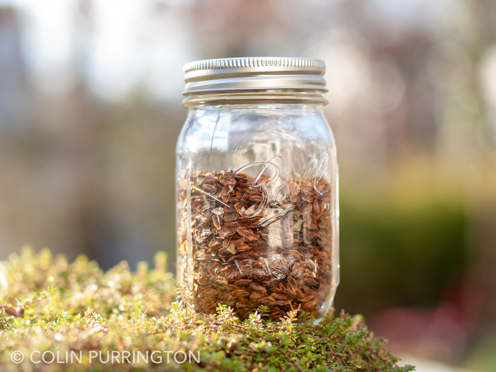
You don’t need to, but I decided to clean my seeds. Here’s the end product:
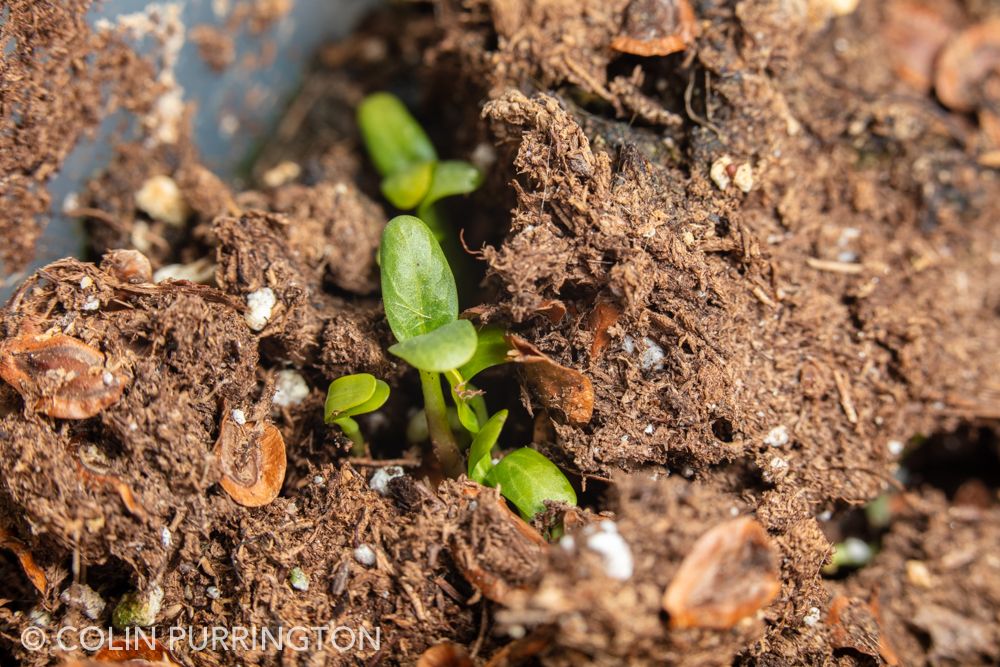
Milkweed seeds germinate best if they are exposed to a period of cold, ideally when moist. So all I did was scatter the seeds on a few large containers (actually, unused litterboxes). Come spring I had hundreds of seedlings emerge.
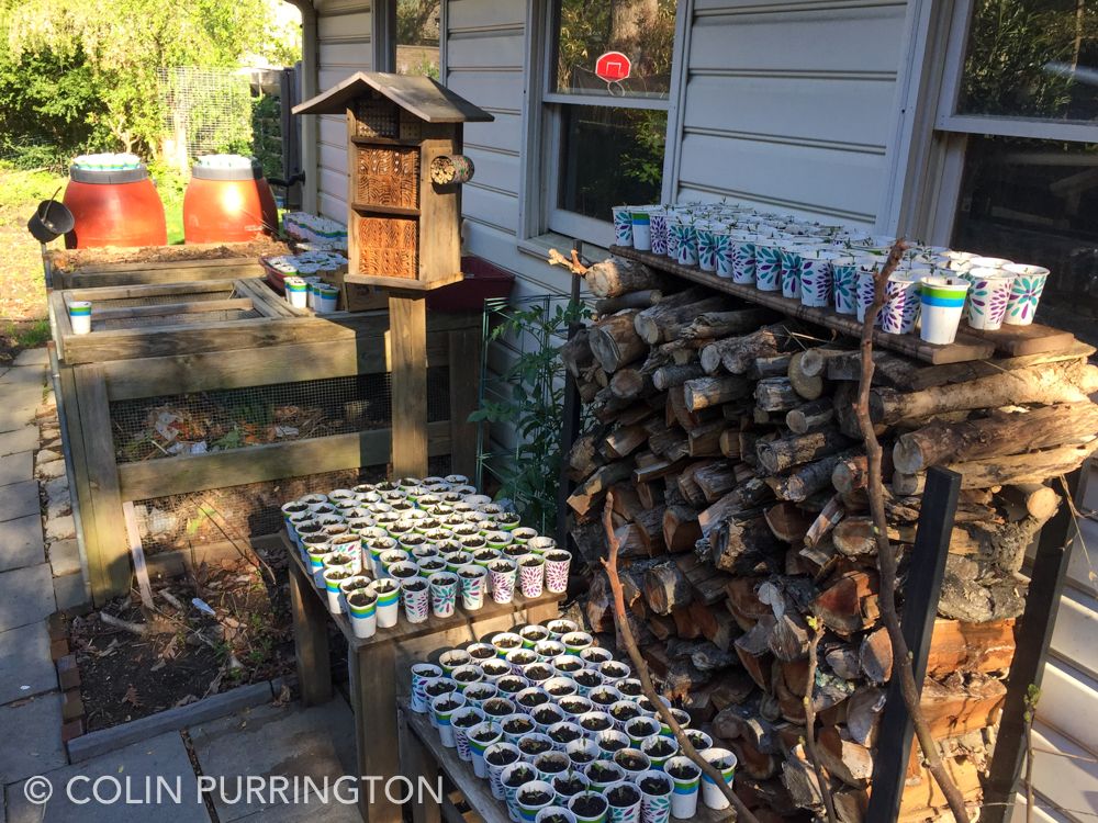
As seedlings emerged I’d transfer them to small Dixie cups. I soon covered almost every square inch of sunny space in my yard. (That’s my bee hotel, by the way.)
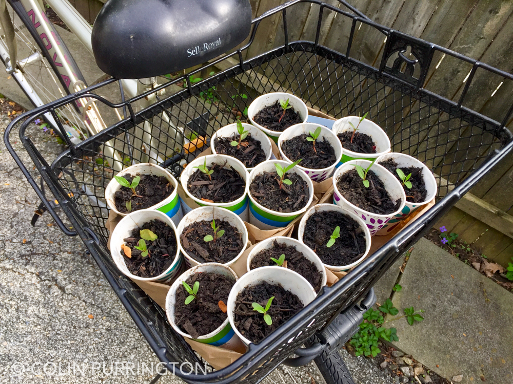
Then I started giving them away to people in town who had expressed an interest in growing milkweed. I put the seedlings into cheap paper cups and then delivered sets of threes to doorsteps. This used up about two dozen seedlings.
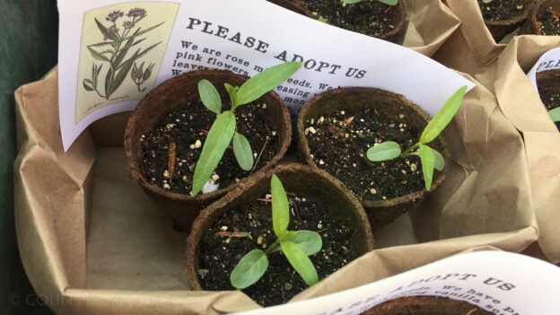
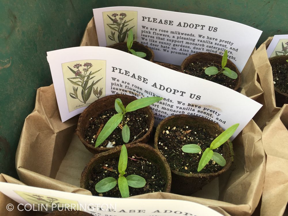
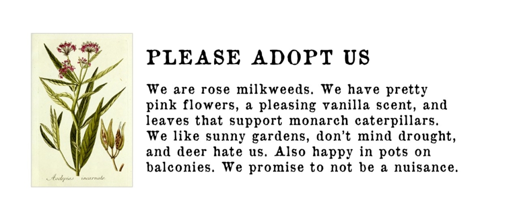
To get people to plant milkweed I thought it might be fun to leave pots around town along with, “please adopt us” notes. I gave away probably 100 this way. Usually the pots would be taken within an hour or so. It was fun leaving them in obscure spots around town, and I was hoping to build some curiosity about who was doing this and why.
Here’s the note I left with each set. I went with “rose milkweed” because I worried that “swamp milkweed” might be a turn-off for some. But same plant: Asclepias incarnata, my favorite milkweed. And it’s native.
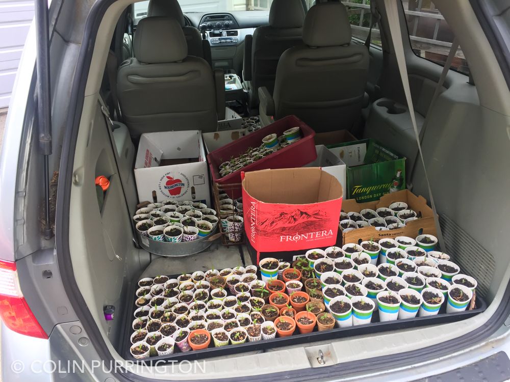
Here are seedlings bound for one of the giveaway events. There were even more pots in the front.
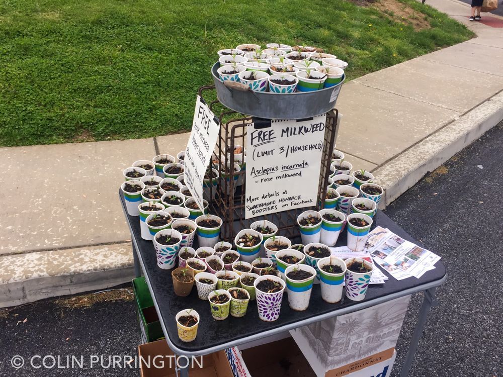
Here’s my display table. I held the events on days when large crowds would be expected, so probably 95% of takers were people who didn’t realize they even wanted milkweed plants.
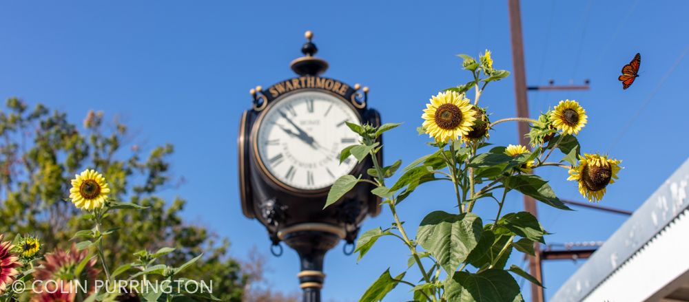
In total, I probably gave away 500 milkweed plants this year. I’m not positive it was a success but I think I noticed more monarchs around town this year. As anecdotal evidence, I wasn’t even trying to photograph a monarch when taking this picture:
If you have milkweed plants and seed pods, give it a try in 2020. It would be especially good if garden clubs across the country made this a priority.

