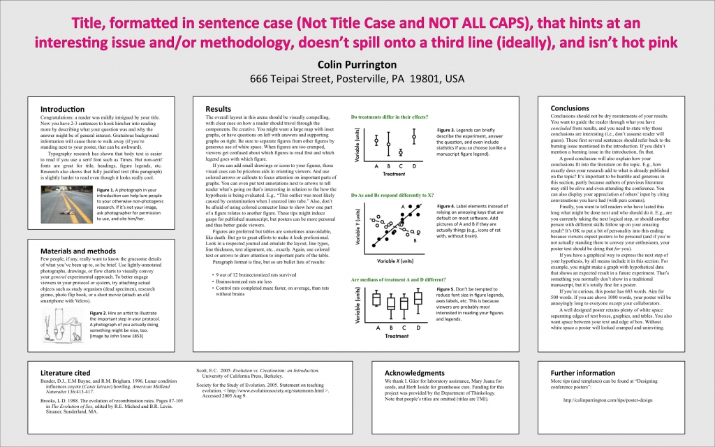
I finally got around to making some long-needed changes to my page on designing conference posters: https://colinpurrington.com/tips/academic/posterdesign. For those who care, the poster-like file with poster tips is now just a PDF, not a Powerpoint template. This PDF will hopefully be useful to those who want to both an example layout and tips on how to craft a poster. Teachers can print this PDF out on a large-format printer and pin it to classroom wall a month before student posters are due. The second big change is that the Powerpoint templates are now text-light, which will make them easier to use as templates (i.e., no need to delete all the annoying “tips” text that was there previously). Templates now come in a few different flavors, too (and more coming). Finally, lots of minor changes to the page itself, though just as long-winded, with apologies. If you know of somebody who needs poster help, please feel free to send them the link.
Tag Archives: layout
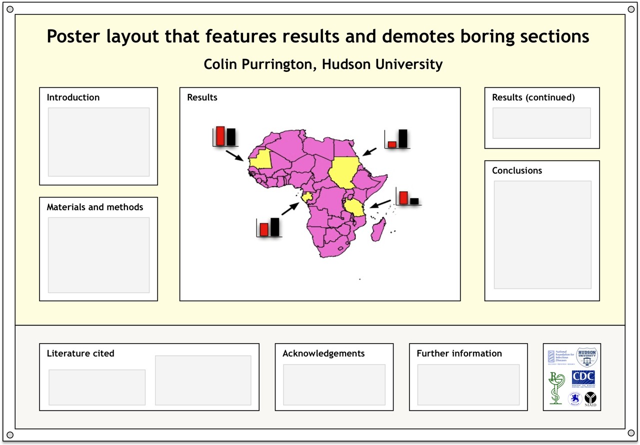
Layout for conference poster
One of my pet peeves about posters at conferences is that they often devote a lot of important real estate to text that nobody really wants to read. So if you’re shopping around the internet for a layout, give the layout below a try. I’ve situated the Literature cited, Acknowledgements, Further information (a section I’m trying to push), and annoying logos in a single strip at the bottom. Doing this pushes the interesting sections up, closer to eye level. I’ll eventually put a template for this up at https://colinpurrington.com/tips/academic/posterdesign.
For those who are interested, the logos in the sample layout are largely related to diseases: I’m presenting at the 2012 Annual Conference on Vaccine Research sponsored by the National Foundation for Infectious Diseases. I don’t know anything about vaccines, for the record. I’m just there to present at a workshop on science communication. I’m bringing hand sanitizer, of course.


