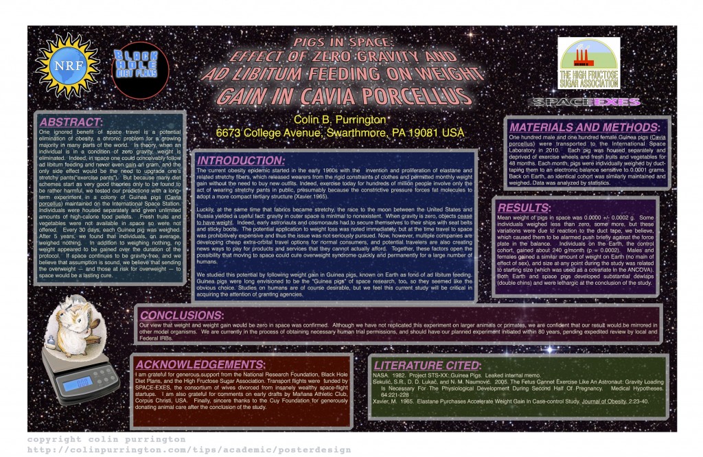
When I give lectures on poster design, I show examples of horrific posters I’ve found on the internet. But I fear that someday the author of a poster I’m critiquing is going to be in the audience and carrying a concealed weapon, so I thought it was time to construct my own bad poster. The result is, “Pigs in space: effect of zero gravity and ad libitum feeding on weight gain in Cavia porcellus.” A list of why the poster is awful is below the image.
I encourage teachers to print the poster and hang in a hallway a month prior to when students’ posters are due. Here’s the PDF. Ideally, also print and hang my poster that shows tips on how to make a poster. More poster tips than you really need, plus free templates, at “Designing conference posters“.

Why this is a terrible poster
- Too much text (I’ve been on mission to push for 800 words).
- Background image is distracting (distracts from illustrations).
- Text box backgrounds are dark, which makes text really hard to read.
- Text box backgrounds are all different colors, for no reason (distracting).
- Text boxes are different widths (distracting, hard to follow flow of poster).
- Some text boxes too wide (aim for 45-65 characters per line).
- Text boxes not separated from each other by pleasing “white” space.
- Text box edges not aligned (distracting).
- Text justified, which causes bad inter-word spacing. Also makes reading harder (brain uses jaggedness of left-justified text).
- Logos are distracting, useless, crowd title.
- Title word art distracting, hard to read, juvenile.
- Title is in all caps, which is harder to read and obscures Latin name.
- Title is italicized, which also obscures Latin name style conventions.
- Author font and color is annoying (comic sans should be reserved for comic books).
- Author font color is too loud relative to other text.
- Results are presented in sentences instead of visually with charts.
- Section headers have too much formatting (big font, bolded, italicized, underlined, and colored — ack!). Choose one. [Note: I forgot to number the sections…that would have been even worse.]
- Terrible graphic of Guinea pig on scale. Need one of the actual set up (pigs eating while weightless, for example).
- Inclusion of an Abstract consumes space needlessly. Abstract section should be banned from posters. Posters ARE an abstract.
- Plus the science is terrible! (Bad science is correlated with bad graphic design, by the way.)
This poster was published in the journal Nature. And yes, that street number is a horrific gravity reference. Sorry.
