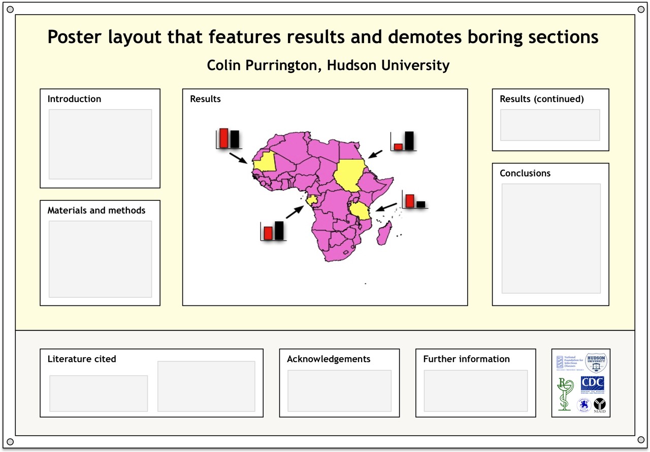
One of my pet peeves about posters at conferences is that they often devote a lot of important real estate to text that nobody really wants to read. So if you’re shopping around the internet for a layout, give the layout below a try. I’ve situated the Literature cited, Acknowledgements, Further information (a section I’m trying to push), and annoying logos in a single strip at the bottom. Doing this pushes the interesting sections up, closer to eye level. I’ll eventually put a template for this up at https://colinpurrington.com/tips/academic/posterdesign.
For those who are interested, the logos in the sample layout are largely related to diseases: I’m presenting at the 2012 Annual Conference on Vaccine Research sponsored by the National Foundation for Infectious Diseases. I don’t know anything about vaccines, for the record. I’m just there to present at a workshop on science communication. I’m bringing hand sanitizer, of course.


Nice template for the poster. The only thing is that I would avoid to use the Mercador’s proyection, especially if you are showing a map of Africa, and to people interested in explaining how important prevention in Africa is.
See this article: http://www.economist.com/blogs/dailychart/2010/11/cartography
I like this template and your advice on making posters is really useful. Thank you for that.
I would like to see more tips on portrait-oriented posters. I know the first advice would be to present a landscape poster because these are much nicer for a number of reasons, but unfortunately most conferences, at least in my field, require posters to be in portrait.
Thanks again for the numerous extremely useful tips.
Hmm. I’ll give this some thought. I’m assuming you found my tips under the templates section of my main page (Designing conference posters)? I’d certainly suggest putting unimportant sections at bottom. And it’s even more important with portrait-style posters to put logos at bottom, too.