
When I give lectures on poster design, I show examples of horrific posters I’ve found on the internet. But I fear that someday the author of a poster I’m critiquing is going to be in the audience and carrying a concealed weapon, so I thought it was time to construct my own bad poster. The result is, “Pigs in space: effect of zero gravity and ad libitum feeding on weight gain in Cavia porcellus.” A list of why the poster is awful is below the image.
I encourage teachers to print the poster and hang in a hallway a month prior to when students’ posters are due. Here’s the PDF. Ideally, also print and hang my poster that shows tips on how to make a poster. More poster tips than you really need, plus free templates, at “Designing conference posters“.
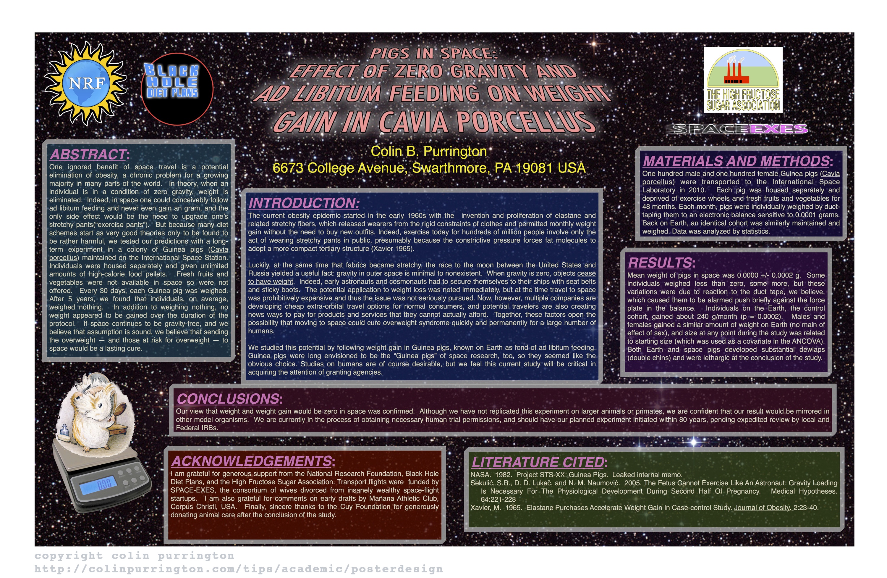
Why this is a terrible poster
- Too much text (I’ve been on mission to push for 800 words).
- Background image is distracting (distracts from illustrations).
- Text box backgrounds are dark, which makes text really hard to read.
- Text box backgrounds are all different colors, for no reason (distracting).
- Text boxes are different widths (distracting, hard to follow flow of poster).
- Some text boxes too wide (aim for 45-65 characters per line).
- Text boxes not separated from each other by pleasing “white” space.
- Text box edges not aligned (distracting).
- Text justified, which causes bad inter-word spacing. Also makes reading harder (brain uses jaggedness of left-justified text).
- Logos are distracting, useless, crowd title.
- Title word art distracting, hard to read, juvenile.
- Title is in all caps, which is harder to read and obscures Latin name.
- Title is italicized, which also obscures Latin name style conventions.
- Author font and color is annoying (comic sans should be reserved for comic books).
- Author font color is too loud relative to other text.
- Results are presented in sentences instead of visually with charts.
- Section headers have too much formatting (big font, bolded, italicized, underlined, and colored — ack!). Choose one. [Note: I forgot to number the sections…that would have been even worse.]
- Terrible graphic of Guinea pig on scale. Need one of the actual set up (pigs eating while weightless, for example).
- Inclusion of an Abstract consumes space needlessly. Abstract section should be banned from posters. Posters ARE an abstract.
- Plus the science is terrible! (Bad science is correlated with bad graphic design, by the way.)
This poster was published in the journal Nature. And yes, that street number is a horrific gravity reference. Sorry.
Haha, What’s wrong with this poster Colin??
What a great “In Your Face example” of what not to do!
Love the blog!
Mike
Mike, it was actually strange as I was making it…I started to like it. I’m really not sure if I’ll ever be the same. Poisoned by comic sans. A terrible way to go. Thanks for visiting.
Some commentary: http://www.metafilter.com/114629/3D-graphs-belong-in-Time-magazine-and-1st-grade
I am Just about to embark on a poster for my Business degree. I’m 45, in full time occupation and thought posters were what we used to hang on our bedroom wall!?!
Do you have examples of a good poster?
I actually really liked the Star Wars scroll at the top. It immediately drew my attention.
I sort of liked it, too. The awfulness started to grow on me.
This. Blog. Is. Brilliant! Thank you for explaining the do’s and don’t do’s of ‘posterism’ in a way that doesn’t make me want to take my own life through boredom. Extremely useful resource and entertaining enough to read even if I wasn’t doing a poster! Thanks for the help!
Ah, another life saved! Great to hear. And good luck on that poster. Don’t bore them.
Add to the list of irksome things: the author’s continued reliance on double spaces after periods.
Ah, I’d forgotten I had done that. Thank you!!
This is hurting to my eyes.
Thanks for the tips and lecture on Poster making.
I don’t know what you mean by this review….Comic sans is my favorite :(
You should repay for your sins
I think if this was displayed at a poster conference, everyone would love it… What is that saying?
I would love to see this poster at a meeting.
Hi Colin. I’m about to give a talk about poster design at a conference. While researching bad examples, I stumbled upon your excellent visualization of “how not to do it.” I would happily use it, so the poster gets the attention it deserves. I had a good laugh about your introduction text.
Sincerely, Eve
Ah, fantastic! Hope the presentation goes well.
Data “was” analyzed by statistics. Is this also one of the counterexamples? Hahaha. This is the most interesting guidance I have ever seen.
I came across this by chance while finishing my course assignment. I’ve learned so much! Thank you for making me laugh all afternoon, Colin.
Sincerely, Selva
So glad you liked! And yes, I used “data was” to annoy people.