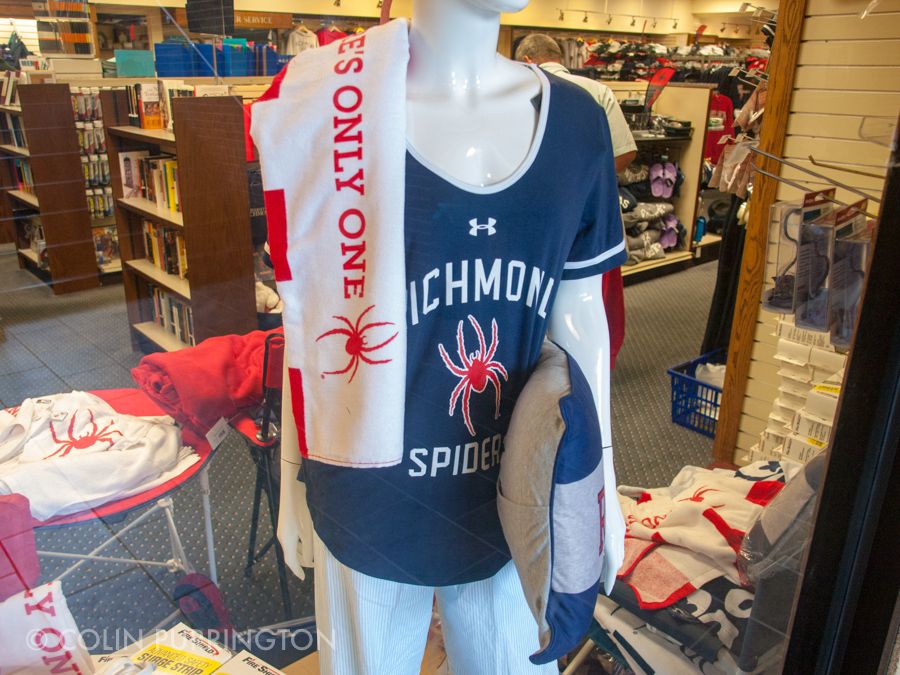
It’s Arachtober so I wanted to share, in case you didn’t already know, that the University of Richmond’s mascot is a spider (named WebstUR, I gather). That’s pretty cool. Not as cool as the Evergreen State Geoduck, but nonetheless pretty notable for a nation that tends to hate spiders. But because Arachtober is about arachnid awareness, I’d like to point out that the logo the school uses is almost certainly a mite, not a spider. Here’s a pic from the campus store:
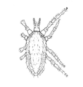
Given the shape of the idiosoma (body) and size of the pedipalps, I’m wondering whether the artist who drew the logo might have based his or her drawing on a tropical fowl mite (Ornithonyssus bursa) or something related. Below is a drawing of one of those, though the legs don’t look quite long enough to match the logo exactly.
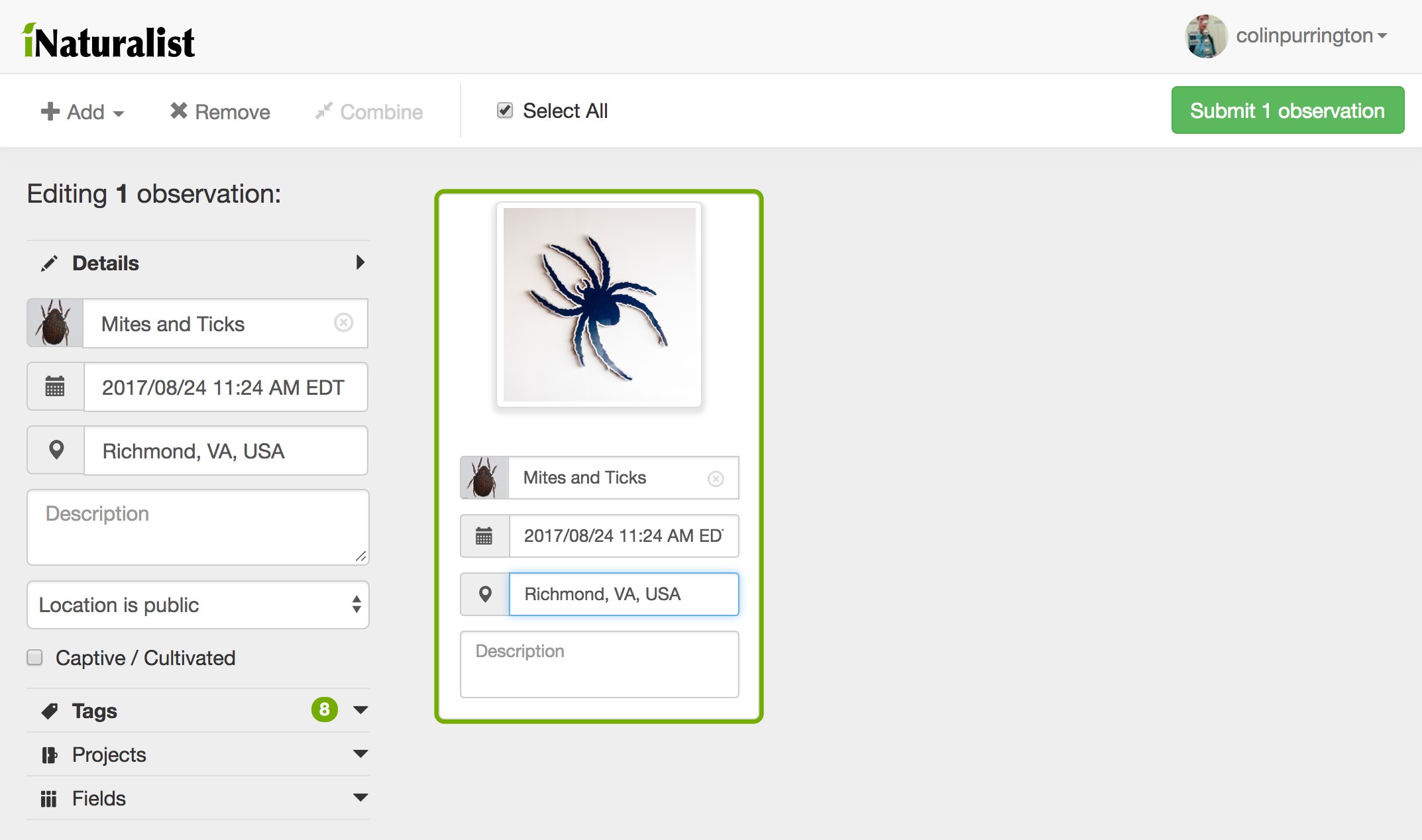
I’m not alone in thinking the logo isn’t a spider. Even a computer can tell. E.g., I loaded the logo into iNaturalist, a website that uses artificial intelligence to recognize and identify organisms. The AI thought the logo was a mite (or tick):
I think that the current image was designed in 2002 by somebody at the Silverman Group, but was probably based on an earlier version of the mite silhouette. E.g., below is from the Athletic Department’s webpage in 2001:
I can’t find an example of the artwork, but I think the mite silhouette was first used in 1971, replacing the Confederate Spider that was commissioned by Richmond College in 1948.
If you have any details on how the University happened to base its logo on a mite, I’d love to hear from you.


