In nature, tunnel-nesting bees are perfectly happy to use logs riddled by boring beetles or piles of dead plants that have hollow stems. That habitat is often in short supply in many yards, however, so it’s necessary to provide hotels if you want to attract them. These hotels can be as simple as a large coffee can filled with hollow reeds … or as elaborate as the three-level one I built. The bees really don’t care.
Types of nesting material
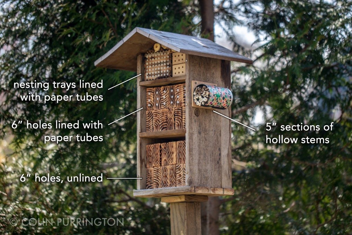
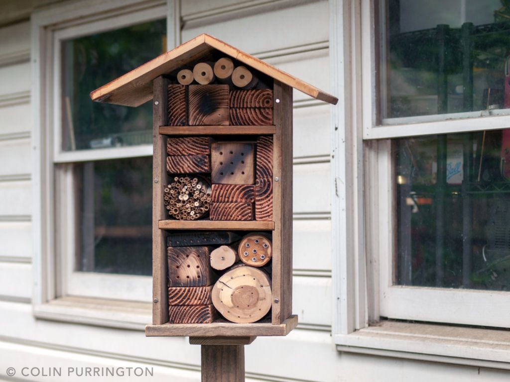
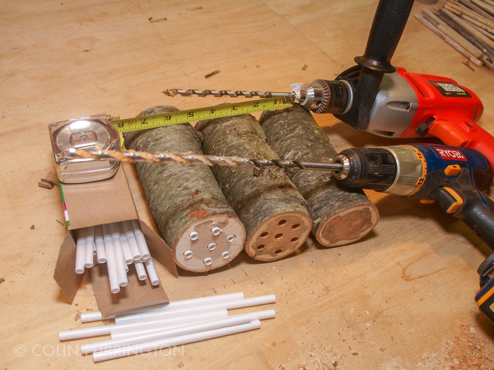
DIY bee hotels can be filled with routered nesting trays (you can buy these or make your own, if you’re handy), wood blocks with paper inserts (these inserts can be purchased), wood blocks or logs with drilled holes (unlined), or just sections of hollow stems (by far the easiest). Or, like house in the photo below, a mix. A hotel should have a roof to keep the tunnel entrances relatively dry, should be situated to get morning sun, and be approximately 5 feet off the ground (so you can enjoy watching them).
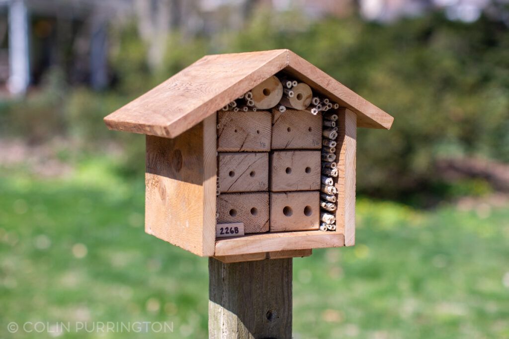
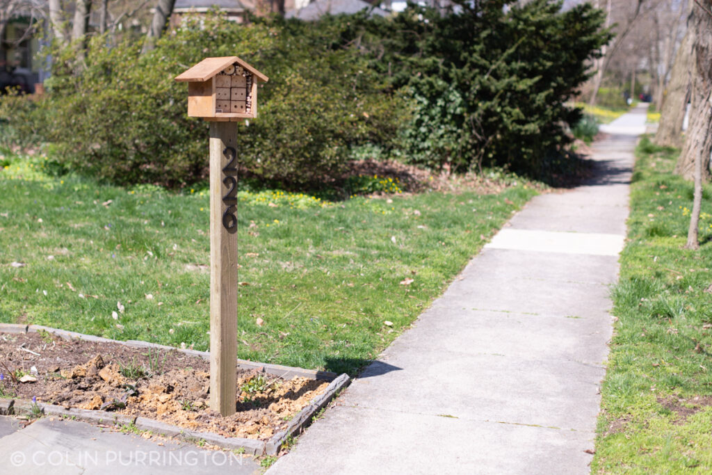
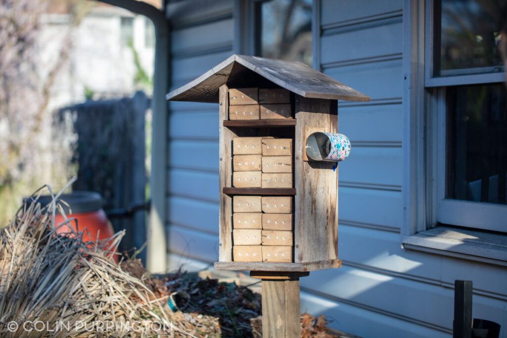
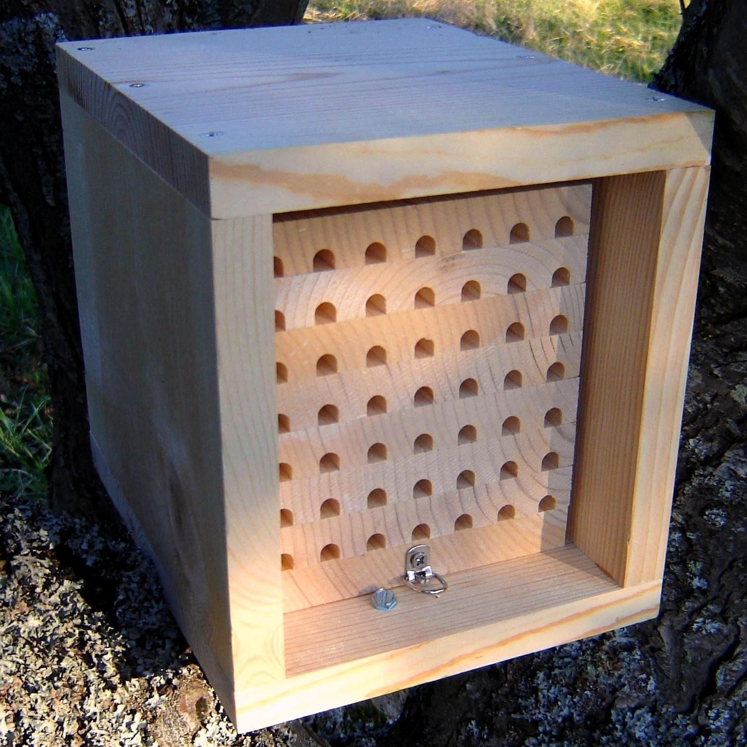
Below is a photograph of my other hotel. It’s smaller and is set up in my front yard to entertain people who walk by. Tunnels are all unlined drilled holes, plus milkweed stems. Holes in the blocks are varied because I want to attract a variety of solitary bees.
Swap nesting materials regularly
The ideal bee hotel is one that allows all the nesting material to be removed each year (or so). By installing fresh nesting material, new tenants each spring will get to move into tunnels free of kleptoparasitic pollen mites and pathogenic fungi. Another benefit of removable nests is that you can remove sections as they get filled, allowing you to replace the spot with the same type of tunnels or with tunnels that have different diameter to cater to a different bee species (there are hundreds). Below are examples of my hotel with different configurations (my 2020 version, on right, is a bit boring).
Protect nests from birds
Woodpeckers are very fond of stem-nesting insects so attach screening to the hotel in such a way that even with their long beaks they can’t get access. Below is example (credit: @BlueEmu on reddit). If you want to see a woodpecker try, see this video.

Emergence boxes
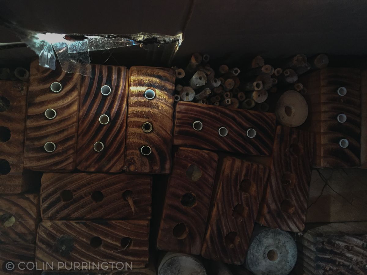
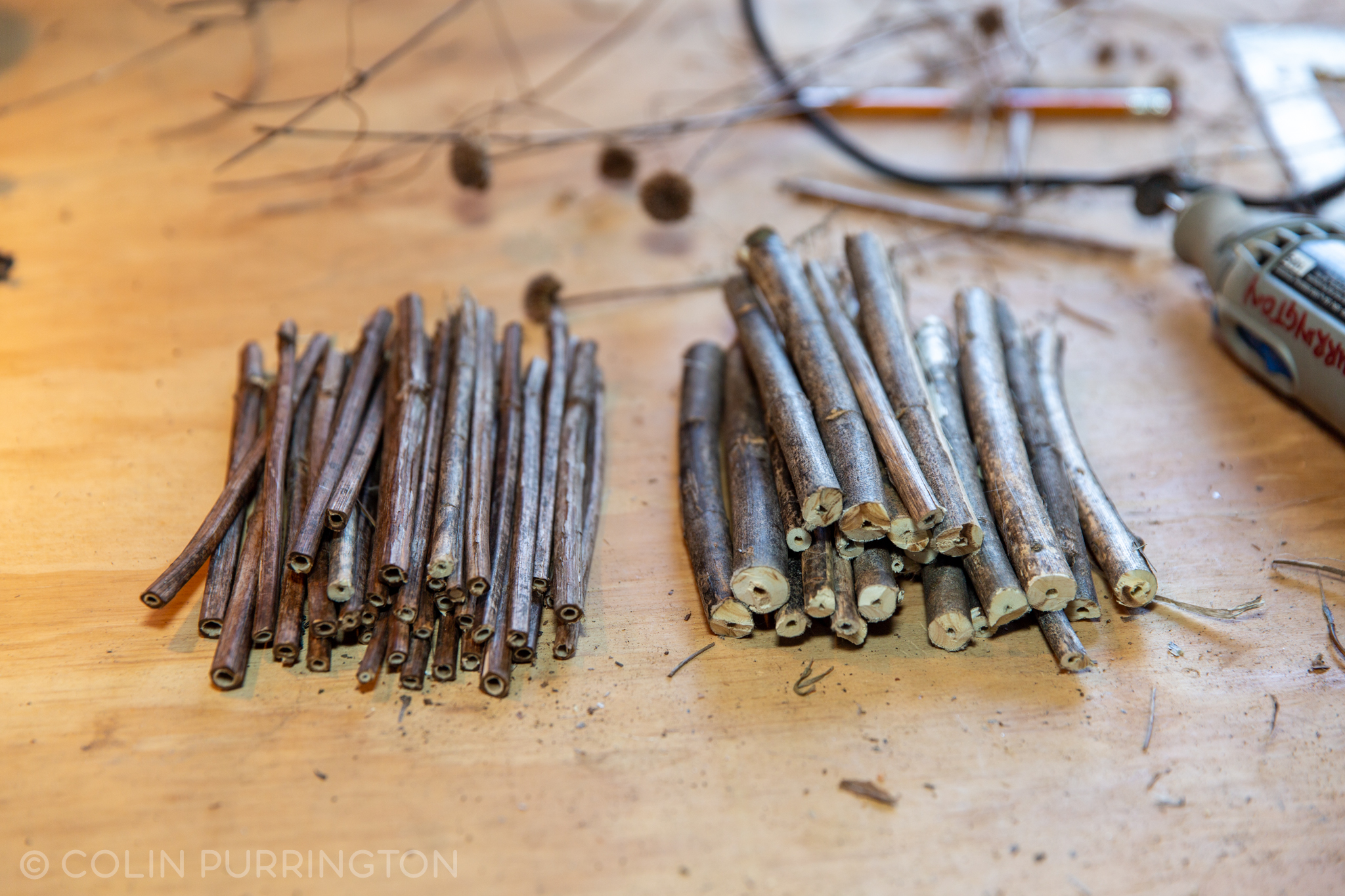
What do you do with the nesting material after you remove it from the hotel? I put mine into a large cardboard box that has holes in the sides and at the top, then store in my unheated garage for the winter. In mid March (before bees in my area start to wake up) I put the box outside in a spot that is dry and gets good morning sun. Then when bees emerge from their cocoons they can escape from the box but are disinclined to re-inhabit the nesting tunnels they emerged from. Here’s a view of the nesting material inside my emergence box.
After several months outside (e.g., in August, long after the last resident has emerged) I take everything back into my shop and redrill holes and sterilize the wood. Then I can reuse blocks in future years.
Cleaning pupae
Lately, I’ve been thinking that I should move entirely to a system where I can sort through pupae at the end of the season. E.g., as summarized here. The reason for this is that I’d like to remove (kill) the kleptoparasitic mites (pic) and Houdini flies (pic) that are likely destroying many of my solitary bees. To enable this process I am going to start using paper straws to line all the tunnels. These straws can then be removed and unwrapped and the contents examined. Below is a photograph showing how drilled holes can be lined with paper straws — just fold over the back overhang and seal with foil tape.
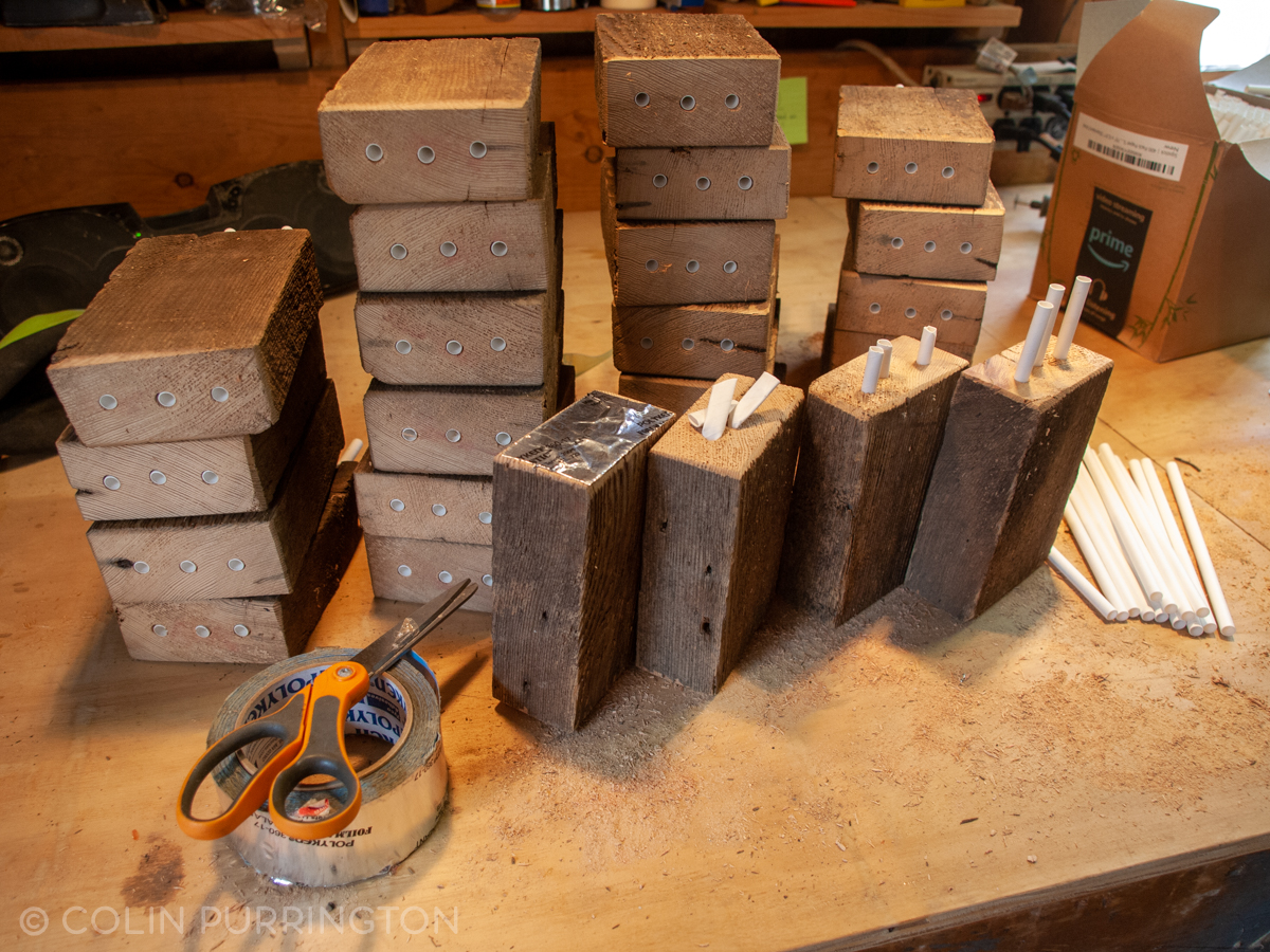
Several companies sell sturdy (and easy to unwrap) paper straws as well as cardboard tubes that can easily accommodate the straws (i.e., you don’t need to drill holes in wood).
Another way to sort through pupae is to use routered wood trays, which you can buy or make (with a router or a table saw). Although some types of trays are better used with straws (to prevent mites from moving from tunnel to tunnel), others fit snuggly enough to be used without them. On my list of things to do is to make some routered nests that are sealed on one side with Plexiglas so that I can observe the bees within (such hotels can be purchased, and are beautiful).
Design tips
- To keep everything dry on something this tall you need a generous roof overhang. Mine extends 5 inches beyond the front of the shelf, plus the wood sections and reeds are set back from that by another inch or so. If you have a shorter house you can have a smaller roof.
- For larger hole sizes you want, ideally, 6 inches of depth. Shorter (4″) tunnels are fine but can result in a male-biased brood sex ratios. If you want to encourage population growth, encouraging the production of females is important. So buy long bits (I really like my 5/16″ auger bit, shown in drill below).
- Burning the front of the wood allows bees to more easily find their holes, plus the darker surface causes the wood to heat up faster in the morning sun.
- Avoid treated lumber or fresh cedar. Per rumors on the internet, those types of wood can result in the death of the larvae. Pine is fine but I think harder wood is preferable because the drilled holes tend to be smoother.
- For cutting reeds to size, I highly recommend using a cutoff disc on a Dremel tool instead of pruners. You can get a really smooth surface with a Dremel.
Examples of nice DIY solitary bee hotels
- Anonymous (nicely routered nesting trays)
- Jordan Arata (beautifully-made observation house)
- Jason Chrisman (video how-to for simple blocks w/ parchment paper liners)
- Marc Carlton (plus excellent maintenance tips)
- Linda Chapman’s hubby
- Jan Cordell
- “GotDono”
- Emily Doorish (you should follow her on Instagram & Twitter)
- Horticultural Centre of the Pacific
- Gord Hutchings (plus good overview of biology)
- Tricia Hogbin (use of cinder blocks is great)
- Lakeside Gardens (tad large but I love public displays of bee affection)
- Joe Larson
- Ed Marshall (NB: screening keeps birds from eating larvae)
- NestBoxTech (plus great instructions, links)
- Pavel (really well engineered)
- Ed Phillips (elegant array of blocks with nice hole diversity; see also this)
- Place des Jardins (trés jolie mais trop grande, je pense)
- Axel Reuter
- Mark Smith
- University of Nebraska Extension (great PDF on topic)
- Goblinius
Additional resources
- Bauer, E.C., L.I. Lynch, D.A. Golick, and T.J. Weissling. 2015. Creating a solitary bee hotel.
- Carlton, M. 2017. How to make and manage a bee hotel: instructions that really work.
- Edmunds, B., R. Little, and R. Sagili. 2016. Nurturing mason bees in your backyard in Western Oregon.
- Farmer, C. Leafcutter bee nests.
- Green, A. Checking into bee hotels.
- Hunter, D., and J. Lightner. 2016. Mason Bee Revolution: How the Hardest Working Bee Can Save the World – One Backyard at a Time.
- Krombein, K.V. 1967. Trap-nesting Wasps and Bees: Life Histories, Nests, and Associates.
- Maclvor, J.S. 2017. Cavity-nest boxes for solitary bees: a century of design and research. Apidologie 48:311-327.
- Maclvor, J.S., and L. Packer. 2015. ‘Bee hotels’ as tools for native pollinator conservation: a premature verdict? PLoS ONE 10:e0122126.
- Mader, E., M. Shepherd, M. Vaughan, and J. Guisse. Tunnel nests for natives bees: nest construction and management.
- McGlynn, D. 2009. Backyard boarding house: how a power drill can attract pollinators.
- Moon(?), C. How to make solitary bee houses.
- Morato, E.F., and R.P. Martins. 2006. An overview of proximate factors affecting the nesting behavior of solitary wasps and bees (Hymenoptera: Aculeata) in preexisting cavities in wood. Neotropical Entomology 35:285-298.
- Nye, W.P. and G.E. Bohart. 1964. Equipment for making nesting holes for the alfalfa leaf-cutting bee.
- O’Neill, K., and J.F. O’Neill. 2013. Cavity-nesting wasps and bees (Hymenoptera) of Central New York State: the Roy H. Park Preserve and Dorothy Mcilroy Bird Sanctuary. Proceedings of the Entomological Society of Washington 115:158-166.
- Palmer, D. 2017. Adventures of an amateur mason bee keeper.
- Phillips, E. Wasps in the bee hotel!
- Seidelmann, K., A. Bienasch, and F. Pröhl. 2015. The impact of nest tube dimensions on reproduction parameters in a cavity nesting solitary bee, Osmia bicornis (Hymenoptera: Megachilidae). Apidologie 47:114-122.
- Tei-Weisenburger, J-L. 2017. Insect hotels: a refuge or a fad?
- Werner, D. Schautafeln zum Thema Insektennisthilfen und Wildbienen.
- Werner, D. Fertig zum Einzug: Nisthilfen für Wildbienen.
- Wilson, J., and O. Messinger Carrill. 2015. The Bees in Your Backyard: a Guide to North America’s Bees.
- Xerces Society. 2009. Tunnel nests for native bees: nest construction and management.
If you’re lazy and just want to buy a mason bee house, here’s my draft listing of companies that seem to make good ones. Please also see my guide to bee houses you should avoid.