
Skip to content

Colin Purrington's blog

nature photography / natural history / misc

  • Home
  • Academic tips
    • Maintaining a laboratory notebook
    • Designing conference posters
      • Templates for better posters
      • Example of a bad scientific poster
      • Conference poster full of tips for creating conference posters
    • Giving science talks
    • Adding photo credits to talk slides
    • Writing science papers
    • Preventing plagiarism
  • Insect hotels
    • Mason bee hotel construction
    • Where to buy mason bee houses
    • Houdini fly alert for owners of bee hotels
    • The horrors of mass-produced bee houses
  • Mosquitoes
    • Tips for killing and repelling mosquitoes
    • Eliminate mosquitoes by eliminating stagnant water
    • Bucket traps for killing mosquito larvae
    • Killing mosquitoes with autocidal gravid ovitraps
    • Indoor mosquito trap made from plastic soda bottle
    • Effects of mosquito sprays on humans, pets, and wildlife
    • 15 mosquito-control strategies and devices that don’t work
    • Yeast-and-sugar mosquito control devices
  • Contact
  • About me
Colin Purrington's blog

Logos on conference posters

Leave a reply

One of my many pet peeves about conference posters is the placement of logos at the top, a practice encouraged by almost all templates on the internet, by mentors who think it’s really cool, and of course by the funding institutions, colleges/universities, and conference organizers who want to see their logos featured. Logos at the top are bad because (1) titles are squished and (2) the charts, illustrations, and photographs have trouble competing visually. Here’s an example:
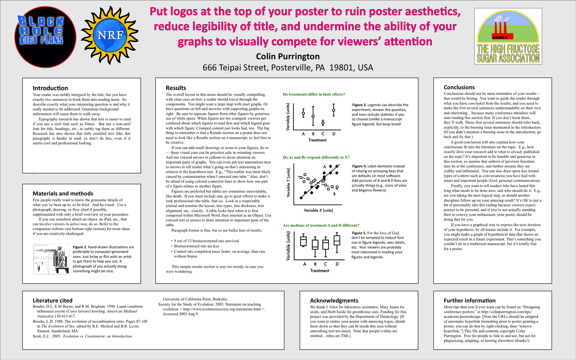
Poster example with logos at top (click to enlarge).

If you absolutely must include a logo on a poster, corral them into a small area at the bottom of the poster, like this:

Placement of logos on a scientific poster

Please share this post with anyone who might be at heightened risk for logo abuse. If you want more tips on poster design, please see my Designing conference posters page.

This entry was posted in Education, Graphic design, Science and tagged conference, logo, logos, meeting, poster, science, scientific, session on March 6, 2013 by Colin Purrington.

Post navigation

← Older posts
Newer posts →

This is a blog with nature photography, biology-related projects, & geeky tips. All posts by Colin Purrington.

Recent posts

  • Wasps emerging from eastern redbud seeds
  • 10 reasons why you shouldn’t buy a bug zapper
  • Red wine trap for controlling Houdini flies at bee hotels

Top Posts & Pages

  • Designing conference posters
    Designing conference posters
  • Indoor mosquito trap made from plastic soda bottle
    Indoor mosquito trap made from plastic soda bottle
  • Getting rid of camel crickets
    Getting rid of camel crickets
  • Tougher Than Tom's Mosquito TNT review
    Tougher Than Tom's Mosquito TNT review
  • Guide to building and managing a mason bee hotel
    Guide to building and managing a mason bee hotel
  • Example of a bad scientific poster
    Example of a bad scientific poster
  • Tips for killing and repelling mosquitoes
    Tips for killing and repelling mosquitoes
  • DIY trap to kill pregnant mosquitoes
    DIY trap to kill pregnant mosquitoes
  • Maintaining a laboratory notebook
    Maintaining a laboratory notebook
  • Where to buy mason bee houses
    Where to buy mason bee houses

Photography site

Colin Purrington Photography

Enter email address to receive notifications of new posts:

  • RSS - Posts
  • RSS - Comments
Proudly powered by WordPress