
If you are in charge of organizing a poster session for your organization, you are in a position to dramatically improve the experience for both presenters and viewers. Below are some ideas.
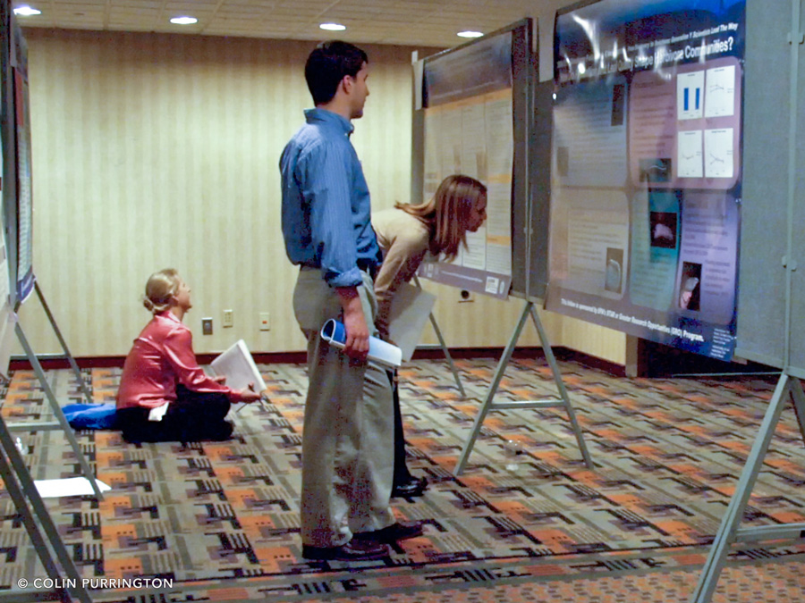
1. Make sure posters can be viewed without stooping or sitting on the floor
Poster sessions are best when posters are easy to read, so before your organization books a venue for the conference, ensure that the site has poster supports that allow the bottom part of a poster to be approximately chest height or higher. If venue doesn’t have those types of boards, find a different venue. Alternatively, modify the poster size specs (e.g., specify only landscape orientation, shrink dimensions) so that the posters can be situated high on the boards that exist. If you don’t do the above, people will have to stoop or even sit to read the lower portions. I’d say that 90% of the photographs of poster sessions on Twitter display this problem. Here’s another example of what you want to avoid.
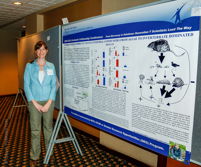
2. Don’t require banners, footers, or logos
Mandating the inclusion of junk like this reduces the amount of area the presenter has to for their own graphics and text. For example, the presenter below was required to include a 15″ banner containing stupid clip art, conference name, and even a patronizing motivational slogan. Plus a footer with more branding.
3. Don’t require an abstract on the poster
A poster is an abstract, so mandating an abstract of an abstract is just silly. It’s totally fine, of course, to ask for an abstract that can be included in a conference booklet.
4. Give a word count target
Perhaps the most valuable advice a society or organization can provide to presenters is a word limit. I’d recommend 500-1000 words. I strongly recommend providing an actual number, or range, rather than just saying “keep your word count low”. Most scientists are so proud of their work that they truly can’t fathom why 4,000 words isn’t “just right.” Another way of providing the advice is to provide a minimum height for a letter once printed.
5. Tell presenters to minimize use of acronyms
Many posters are so crammed full of acronyms and jargon that they are intelligible only to members of the same laboratory. Part of the problem is that most scientists assume that their colleagues know what the acronyms mean. Another problem is that smart people assume a viewer can easily hold 10 new acronyms in their head if they are introduced early in the poster. The viewer might be able to do this but I can assure you they do not want to.
6. Show examples of good posters, with commentary
Find a few good posters from previous meetings and provide some commentary about each poster so that attendees know what is good about them. Put these posters on the organization’s website far in advance of the conference date.
7. Don’t provide templates
There are three reasons for this advice. (1) If you provide a template with lapses in aesthetics, color choice, font size, etc., everyone at the meeting will adhere to those mistakes. (2) A template will force all attendees to produce similar posters. When every poster in the room looks the same, a little bit of everyone dies inside. Let people be creative. (3) Templates mandated for conferences are often PowerPoint files, which forces everyone to use Powerpoint instead of software that is actually designed for page layout. It’s true, of course, that almost everyone uses PowerPoint for posters, but your society can help break this dependency.
8. Post judging criteria prior to meeting
If posters will be judged, tell attendees in advance what criteria will be used. Post the forms that the judges will be using. And inform judges that the top award should not be automatically given to the poster with the smallest font or most charts. Seriously, judges have to stop doing that.
9. Provide guidance on a permanent web page
Whatever tips you end up providing to your members, keep the advice on a stable web page on your professional organization’s main site, not on some meeting page that changes each year.
10. Use mini posters
If you have a mixer or other social event at the start of a conference, provide colored pens and challenge attendees to sketch their research (or organism) onto sticker labels that they can then affix to their shirts. Attendees can then point to their mini-posters (e.g., during elevator pitch) and get people excited about visiting the actual poster. I’ve done workshops involving mini-posters at Swarthmore College, Sigma Xi meetings, NYAS, EPA, and DOE and they are effective and fun. This article gives details.
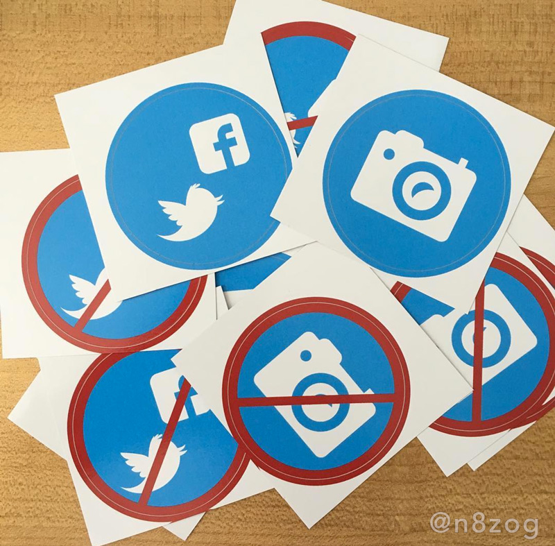
11. Protect posters from unwanted photography
Sometimes people would prefer that their unpublished results aren’t broadcast to the world on Twitter, while others presenters are desperate for that expoure. So provide a variety of stickers (or cards with pins) that presenters can attach to their posters. Here are some stickers.
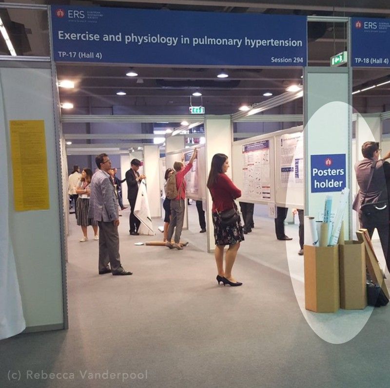
12. Provide boxes for poster tubes
Tubes underneath all the posters look messy, plus are tripping hazards for people who might be coming from wine/beer mixer. Example.
13. Don’t turn poster sessions into lectures
Some meeting organizers apparently set up rooms where people present their posters to a large audience (example 1, 2, 3). This is stupid. Unless the screen covers the entire wall of the room, members of the audience cannot read anything on the poster. .