Some random thoughts on how to keep your figures flattering.
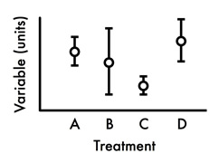 Use line plots to show means (=averages). Much better than bar graphs because you can easily see the variation around the mean(s). Also removes the temptation to fill bars with different colors/patterns, which is almost always annoying. Error bars can be standard errors, standard deviations, etc., so be sure to specify in the figure legend which type you’ve displayed. Also specify the sample sizes for each treatment in legend. (Comparison of means can be done with unpaired Student’s t-test, ANOVA, etc.)
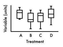 Use box plots to displays medians (when one or more groups have non-normally distributed data). The “box” contains 50% of the data points, and the middle line of the box is the median. The tips of the projecting bars show minimum and maximum values. There are several ways to make these graphs (Excel instructions, e.g.), so it is critical to explain graph elements in the figure legend. List sample sizes, too. (Comparisons of medians can be done with Wilcoxon rank sum tests, Wilcoxon signed rank tests, and Kruskal-Wallis tests, among many others.)
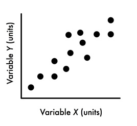 Use scatterplots to show relationships (correlations) between continuous variables. Correlations say nothing about causality. You can provide a correlation coefficient and statistical significance either in the figure legend (you wouldn’t do that in a manuscript, however) or directly next to your cloud of points so that reader doesn’t need to hunt through your figure legend or results text to find out why the graph is being show…make it easy on your poster visitor.
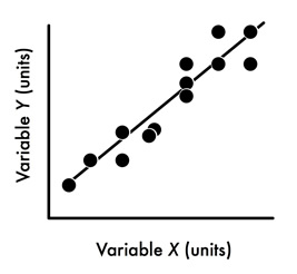 Use regression plots to display how one variable causes variation in a second variable (on Y-axis). As for correlation analysis, you can put the details in the figure legend, but it’s better to situate your findings in a graphical way on your graph. For example, you could put the statistical outcomes on graph in red, along with a phrase in English describing why reader should care. Make the data points bold and large so that the focus of the plot are the data not line (that’s my preference).
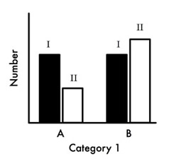 Use bar graphs to show count (=discrete, discontinuous) data. As stated above, bar graphs suck for displaying means. But your mentor probably loves to use bar graphs for displaying means, and has probably done so for 80 years … so you’re probably in a fine pickle about what to use without offending him/her. Good luck! (You can compare counts with goodness of fit tests and contingency chi-square tests, for example.)
Using this page
Here’s a citation if for some reason you’d like to quote me or to include one of the figures in a slideshow:
Purrington, C.B. Watch your figures. Retrieved YYYY-MM-DD from https://colinpurrington.com/tips/figures.
For those who might be interested, the graphs are all sketched out with Omnigraffle.
ⓒ 1997-2015 Colin Purrington
