Tag Archives: powerpoint

Adding image credits to lecture and research talk slides

Here’s an annotated example of how to include photograph title, copyright status, photographer’s name, and URL on a slide. The most critical parts are the photographer’s name and the URL.

Slide04

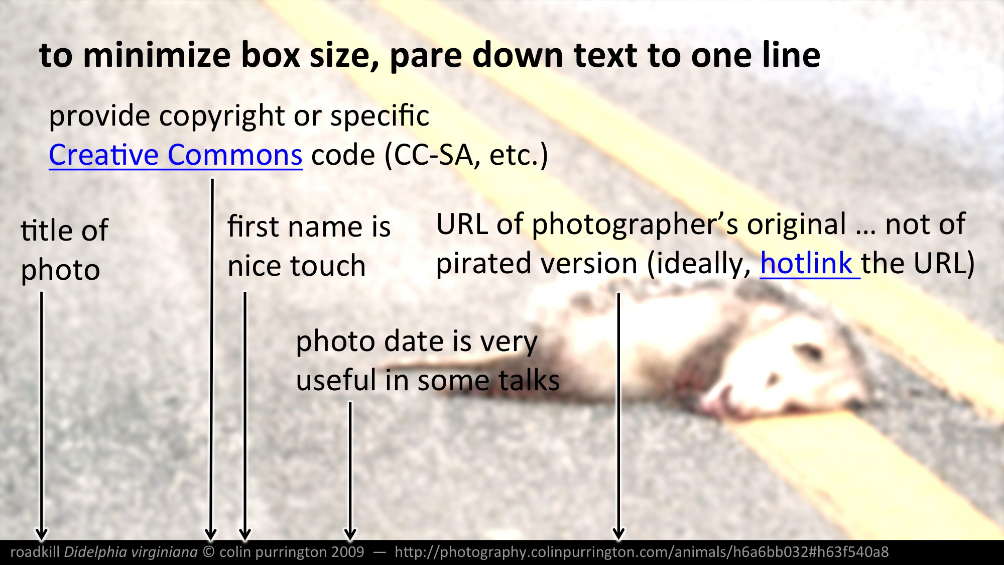
You can change the color of the box and the text, of course, and even orient the information vertically if that fits your talk scheme better.

How to find creator’s name

When you find an image via an online search, sometimes (usually!) it’s not clear who made it. But you should figure it out even though it takes time. To track down the name of the photographer or artist, try Jeffrey’s Exif viewer, Tineye Reverse Image Search, and Google Inside Search. If you can’t find the author, find a different image to use. Aim for a talk in which every image has a credit.

Image location

Providing a name is important, but it’s also critical to display where the original image is located. For most images, that means providing the URL on the photographer’s website. I.e., you might initially have found the image on a different site (e.g., Pinterest), but using the image search techniques above you should track down where the photographer houses the original. Similarly, if the original is in a book or magazine article, provide that source information. If you can’t be bothered to track down this information, don’t use the image. Photographers spend tens of thousands of dollars on fancy equipment and spend years accumulating quality shots, so honor that effort.

Be a role model

If you have a room full of impressionable students, please pause once during your lecture (or semester) to comment about why image credits are just like attributions for copied text. Explain that, yes, it does take some time to track down the photographers’ names and image locations but that it’s important to do so. Make it clear that providing image credits is part of the academic honesty policy of your school. Indeed, make sure “add image credits” is part of your syllabus if you require students to make presentations of their own.

Is it OK to post your talk slides online?

If you have used copyrighted photographs or illustrations, the answer is “no”. The answer is the same if you are an academic at a non-profit institution. I.e., although you can claim “fair use” to include copyrighted visuals in a presentation without getting permission from the creators, current United States copyright law does not allow you to publish those images, even if you think that’s part of your job. So if you promise your students “I’ll post these slides online later”, you are legally required to delete the copyrighted images before doing so. Note that this prohibition against publishing other people’s copyrighted work applies even if you post your slides on a content management system like Blackboard, Moodle, or Google Classroom. Sorry, I’m just the messenger here.

Useful reads on using images in slides

  1.  The Educator’s Guide to Copyright, Fair Use, and Creative Commons,
  2. Code of Best Practices in Fair Use for OpenCourseWare,
  3. Washington State University Fair Use Guidelines,
  4. UCLA Drops Copyrighted Videos From Course Web Sites After Legal Threat,
  5. The TEACH Act.
  6. Cite and Attribute Your Sources.

Example of a bad scientific poster

When I give lectures on poster design, I show examples of horrific posters I’ve found on the internet. But I fear that someday the author of a poster I’m critiquing is going to be in the audience and carrying a concealed weapon, so I thought it was time to construct my own bad poster. The result is, “Pigs in space: effect of zero gravity and ad libitum feeding on weight gain in Cavia porcellus.” A list of why the poster is awful is below the image.

I encourage teachers to print the poster and hang in a hallway a month prior to when students’ posters are due. Here’s the PDF. Ideally, also print and hang my poster that shows tips on how to make a poster. More poster tips than you really need, plus free templates, at “Designing conference posters“.

Example of bad scientific poster (copyright Colin purrington)

Why this is a terrible poster

  1. Too much text (I’ve been on mission to push for 800 words).
  2. Background image is distracting (distracts from illustrations).
  3. Text box backgrounds are dark, which makes text really hard to read.
  4. Text box backgrounds are all different colors, for no reason (distracting).
  5. Text boxes are different widths (distracting, hard to follow flow of poster).
  6. Some text boxes too wide (aim for 45-65 characters per line).
  7. Text boxes not separated from each other by pleasing “white” space.
  8. Text box edges not aligned (distracting).
  9. Text justified, which causes bad inter-word spacing. Also makes reading harder (brain uses jaggedness of left-justified text).
  10. Logos are distracting, useless, crowd title.
  11. Title word art distracting, hard to read, juvenile.
  12. Title is in all caps, which is harder to read and obscures Latin name.
  13. Title is italicized, which also obscures Latin name style conventions.
  14. Author font and color is annoying (comic sans should be reserved for comic books).
  15. Author font color is too loud relative to other text.
  16. Results are presented in sentences instead of visually with charts.
  17. Section headers have too much formatting (big font, bolded, italicized, underlined, and colored — ack!).  Choose one. [Note: I forgot to number the sections…that would have been even worse.]
  18. Terrible graphic of Guinea pig on scale. Need one of the actual set up (pigs eating while weightless, for example).
  19. Inclusion of an Abstract consumes space needlessly. Abstract section should be banned from posters. Posters ARE an abstract.
  20. Plus the science is terrible! (Bad science is correlated with bad graphic design, by the way.)

This poster was published in the journal Nature. And yes, that street number is a horrific gravity reference. Sorry.