I was invited to talk about poster design in Berkeley (DOE NNSA SSGF) and DC (DOE CSGF) this past summer, and used the opportunity to test out fabric as a medium for large-format conference posters. Below are some photographs if you’re curious how logos, illustrations, and photographs look when viewed close up on fabric. By the way, I ordered the posters from PhD Posters (they mailed to my house in a tube, inside a box). And if you’re interested, my poster design tips are here (rather long-winded because I’ve maintained page since 1997).
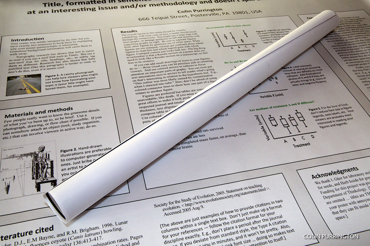
The rolled up poster above is also fabric. I didn’t have the nerve to fold it into luggage-sized square, but I’ve heard that it can be done … though crease lines an issue. Might be able to iron them out, I’ve also read.
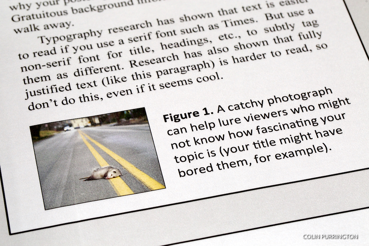
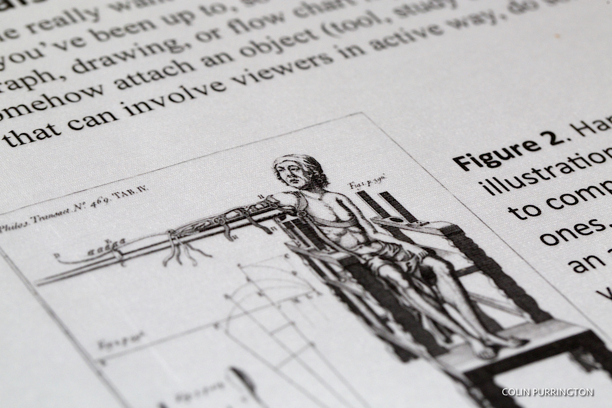
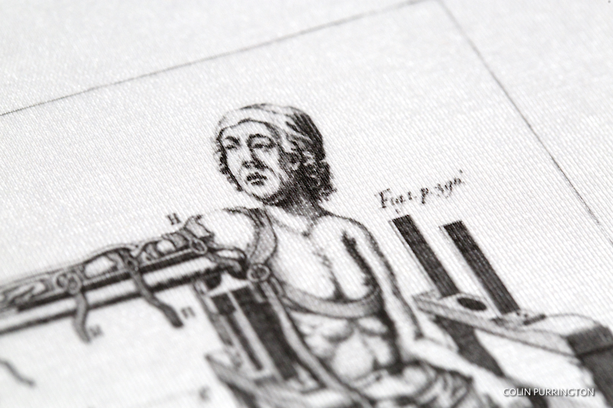
The photograph above isn’t as crisp as a glossy poster, but was totally fine for my purposes. If it really mattered, I’d just print a copy on my photo printer at 1200 dpi (or whatever) and then use double sided tape to attach. Even paper posters have fairly low photo quality, so attaching a high-resolution version is always an option when you need it.
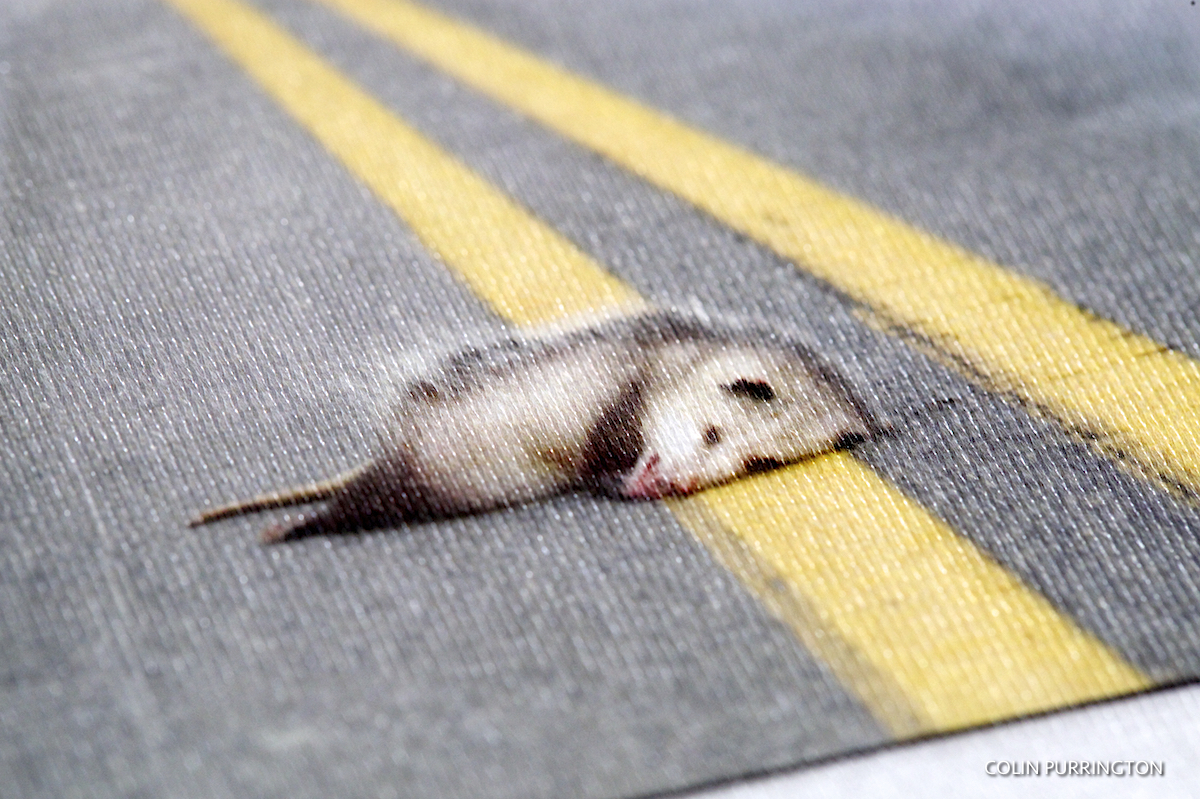
Yes, you can see the fabric if you get close enough. People standing 6 feet away wouldn’t notice and probably wouldn’t care if you told them.

![]()
This logo is actually from the poster that is rolled up. It’s at https://colinpurrington.com/2012/example-of-bad-scientific-poster/ if you want to see the whole poster (you can download and print for your class, if you’d like; yeah, students would just love that).
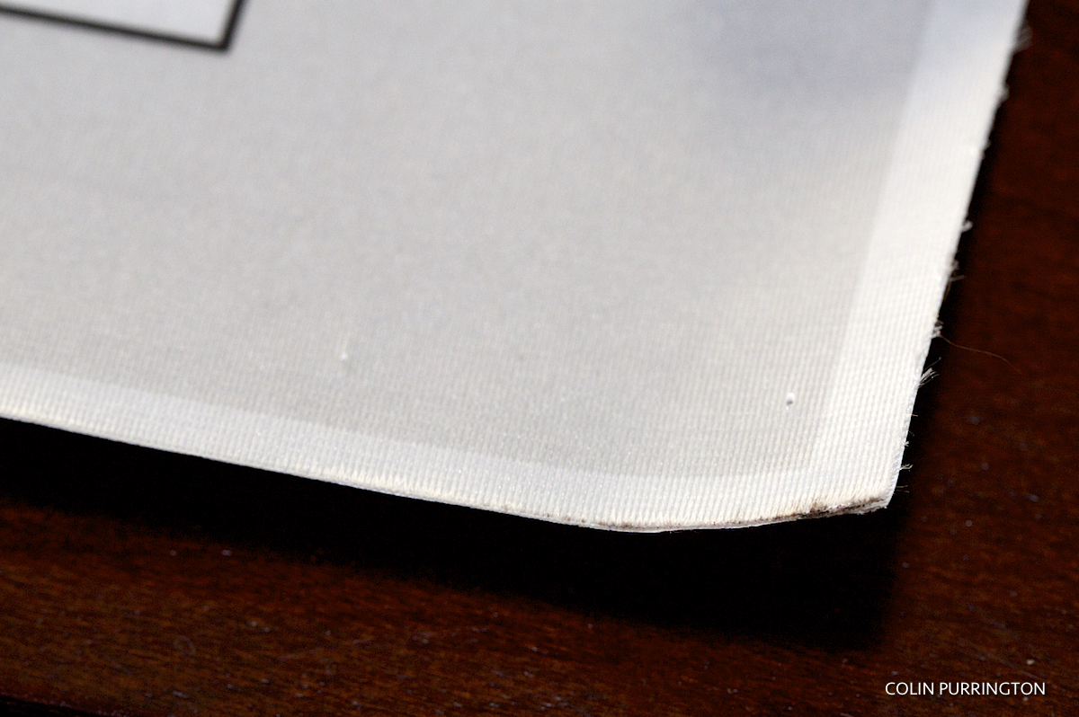 This photograph shows how the edges can get a little frayed. Holes from pushpins are also visible. Much less annoying than the rips and gaping holes that paper gets.